![Digital ritual. Embody the blood of the prophet by writing on your [physical] skin. Co-developer, primary designer, art director.](data:image/svg+xml;base64,PHN2ZyB4bWxucz0iaHR0cDovL3d3dy53My5vcmcvMjAwMC9zdmciIHg9IjAiIHk9IjAiIHZpZXdCb3g9IjAgMCAxNDQwIDgxMCIgd2lkdGg9IjE0NDAiIGhlaWdodD0iODEwIiBwcmVzZXJ2ZUFzcGVjdFJhdGlvPSJub25lIj48cmVjdCBmaWxsPSIjMjAyMjE4IiB3aWR0aD0iMTAwJSIgaGVpZ2h0PSIxMDAlIi8%2BPC9zdmc%2B)
Digital ritual. Embody the blood of the prophet by writing on your [physical] skin. Co-developer, primary designer, art director.

Cognitive Behavioral Therapy-informed deckbuilding RPG. Systems designer.
![Stylish high-energy battle royale mobile party game! Map Design intern [NetEase Games].](assets/images/gallery62/ead768c9.jpg?v=0e4f1676)
Stylish high-energy battle royale mobile party game! Map Design intern [NetEase Games].

Wacky physics-based ski-racing game where you're tethered to your partner. Level and UI designer.

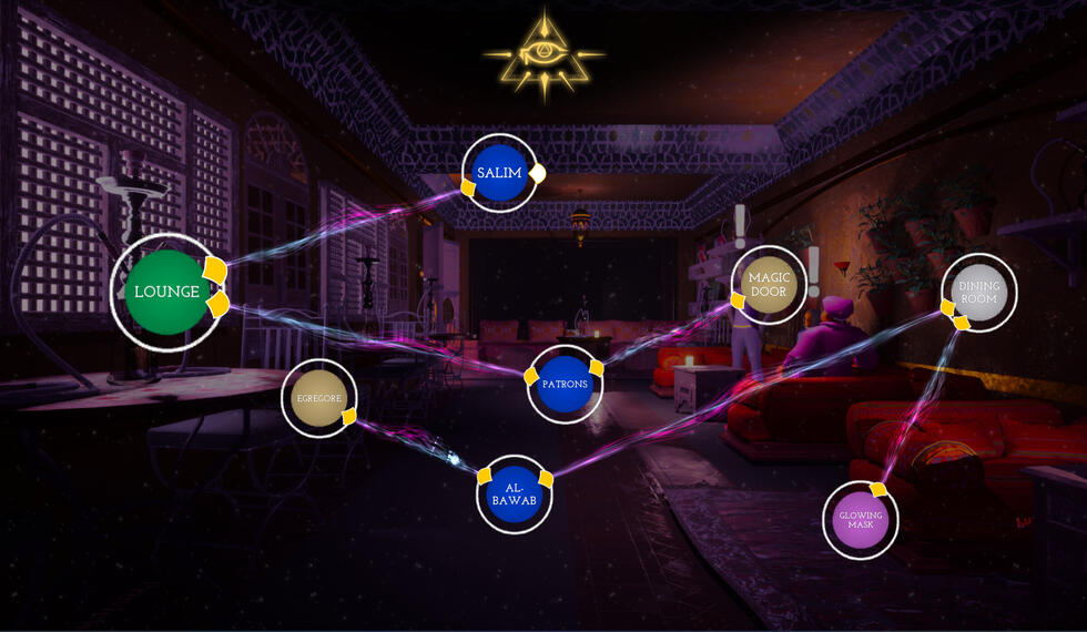
Draw connections between concepts to shape your reality in this esoteric puzzle-adventure game. Designer.
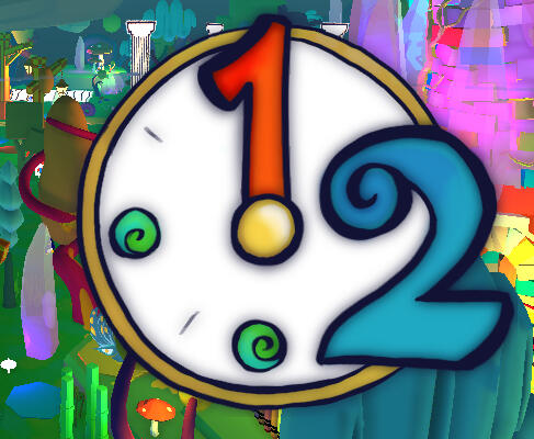
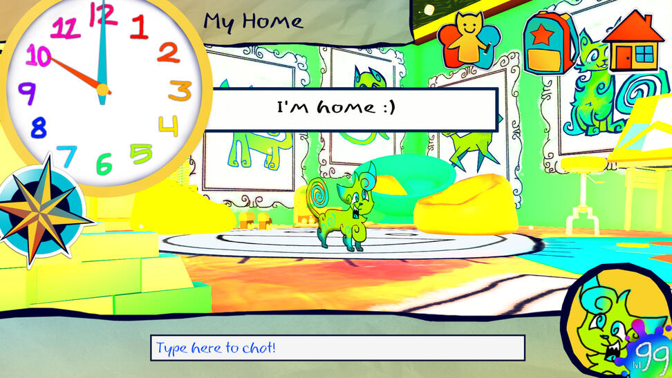
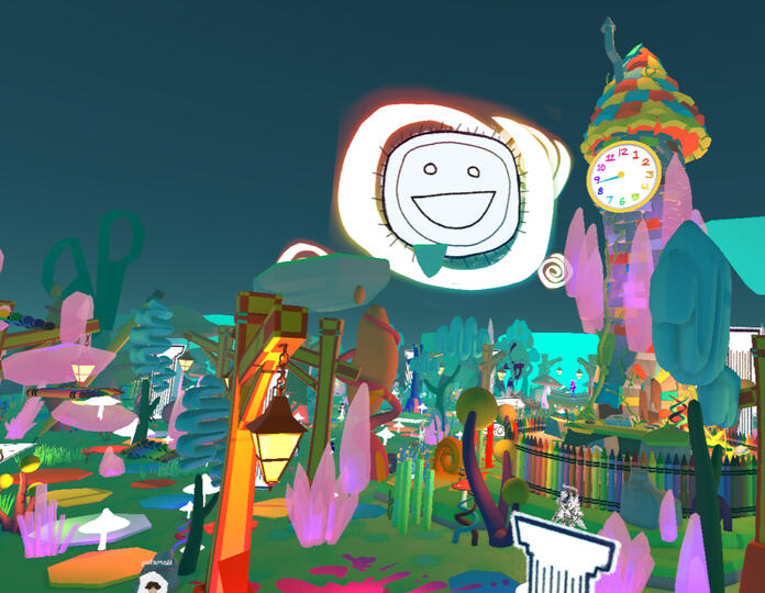
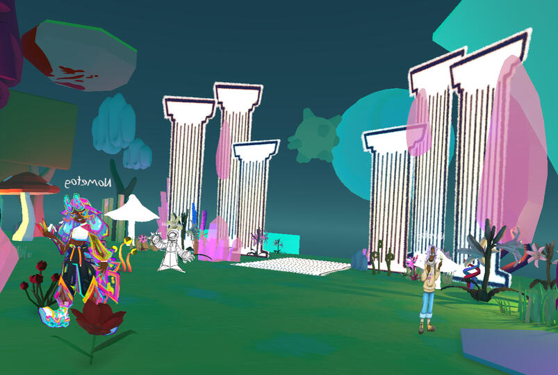
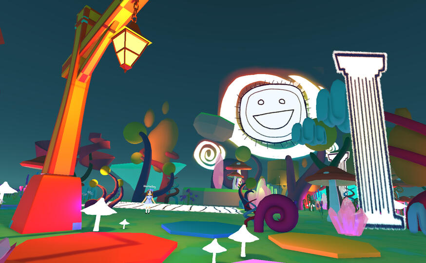
Explore the last breaths of your dying childhood MMO. Co-developer, primary designer and art director.

Tabletop game/high school biology module for Chytrid disease modeling and understanding. Game design intern and consultant.

Emergent sandbox management game where you balance the emotions of a mysterious alien mind. Systems designer, design researcher.
Who I am: Anik. Robot dinosaur and computer bug.
What I am: Game developer, systems designer, and researcher. I like making "weird" things work.
What is above: Me! Click on the arrows to learn more.
What is around: Games I've worked on! Click on the images to see detailed write-ups.Talk to me about: Virtual worlds and MMOs, particularly ones from the 2000s-10s, insects, dinosaurs, medical games and arts research, fashion game scoring systems (or really, for any game that scores a player's output), games archiving, DIY fashion, and dinosaurs. Or check my about section for an in-depth description.
CURRENT:
Glorgo's Microplastics Mine (USC Games Capstone): Lead Designer
Evil Evil Games: Level/Systems and UI Designer
Gay Gaming Professionals 2026 Scholar
PREV:
California Academy of Sciences: Game Design Intern + Consultant
NetEase Games: Map Design Intern
CALIFORNIA ACADEMY OF SCIENCES
Outbreak! Racing the Clock to Stop a Frog-Killing Fungus is a tabletop role-playing lesson plan for high school students. It simulates the Chytrid virus outbreak, putting the students in the shoes of researchers in different countries. Players use mathematical models to simulate the spread of the virus in order to understand how it can be prevented.
Game Design Intern + Consultant
Researched existing game comparables as reference material.
Proposed system changes based on playtest data.
Analyzed the game's compartmental SIR modeling system for effective communication of real-life pandemics.
Provided feedback for and revised gameplay documents.
June - November 2025
Team size: 4
SKIJORING!
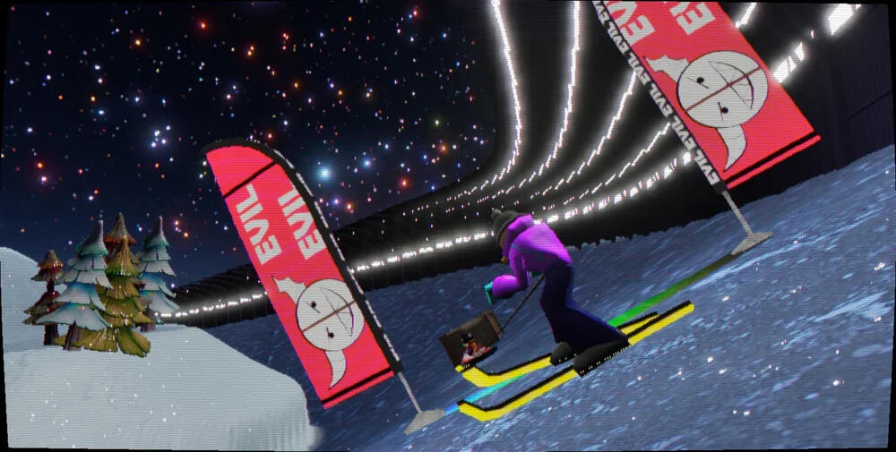
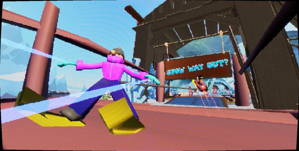
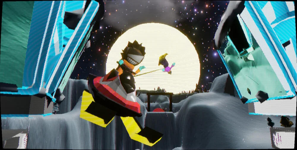
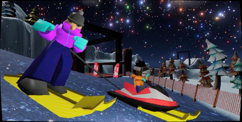
Skijoring is a sport where a skier is strapped to a object that moves way too fast, for fun.
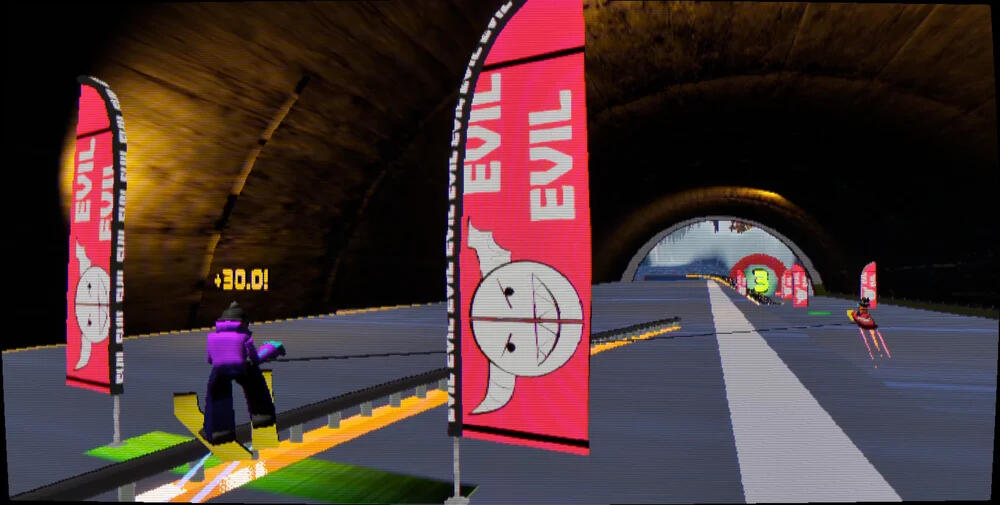
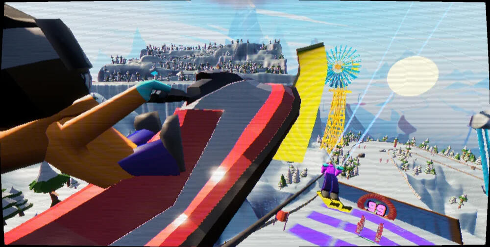
Skijoring, by Team Evil Evil, is a stylish co-op arcade skiing game. One player leads as a snowmobiler with player 2, a skier, tethered to them. Madness ensues.
Level + UI Designer
Alongside an initial team of 9, developed Skijoring from pitch to demo within the 7-week period of the Amazing Seasun Seed Jam.
Drafted, iterated on, built, and setdressed custom co-op racetrack levels in Unreal engine.
Pitched, designed, and created racing obstacles.
June 2025 - Present
Team size: 12
Featured at the M.I.X. Showcase at LA Comic Con 2025.
To be published by Monster Theater Games.
NETEASE GAMES
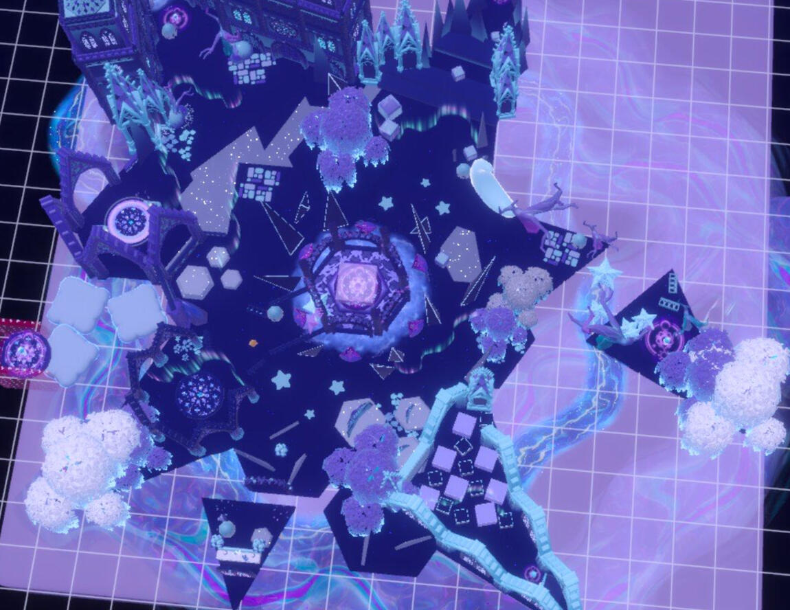
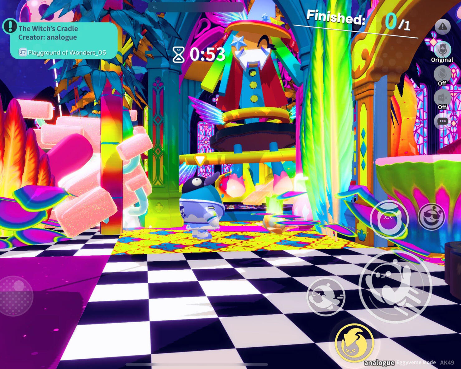
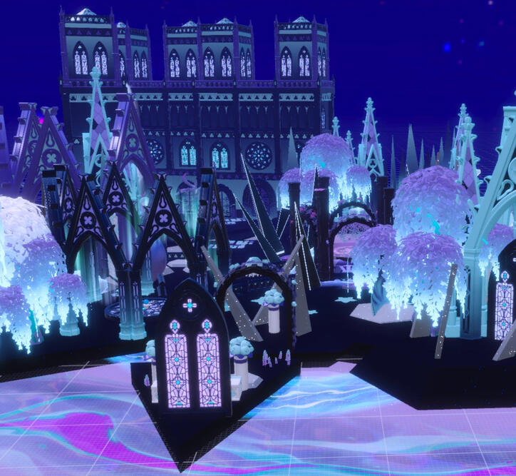
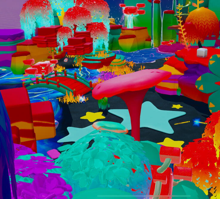
EGGY PARTY! A trendy and goofy battle royale party game, complete with a whole Eggyverse of custom maps!
I was a Map Design Intern from August to December 2024.
Map Design Intern
Create custom levels, design documentation, and tutorials for Eggy Party's map workshop.
Collaborated with R&D and community management teams to create maps reflecting player desires.
Attended bi-weekly design meetings and daily standups with a remote international team.
Recruited new players, held playtests, and supported the 100M+ plus community of Eggy Party, with a focus on expanding the North American playerbase.
August - December 2024
Team size: 10 (sub), 400 (overall)
Prism of You
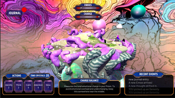
Experiment with emotions in this emergent sandbox simulation by identifying, engaging, and expressing dynamic creatures known as Emoes - all while trying to maintain balance and uncover the secrets of this mysterious alien world.
Design Researcher / Systems Designer
Conducted academic psychology research and integrated it into preliminary design.
Participated in weekly design sessions + standups.
Created systems diagrams and paper prototypes to better understand the game's emergent interactions.
Wrote system design specs for game management systems.
Team size: 27
Summer - Winter 2024
Released on Steam!
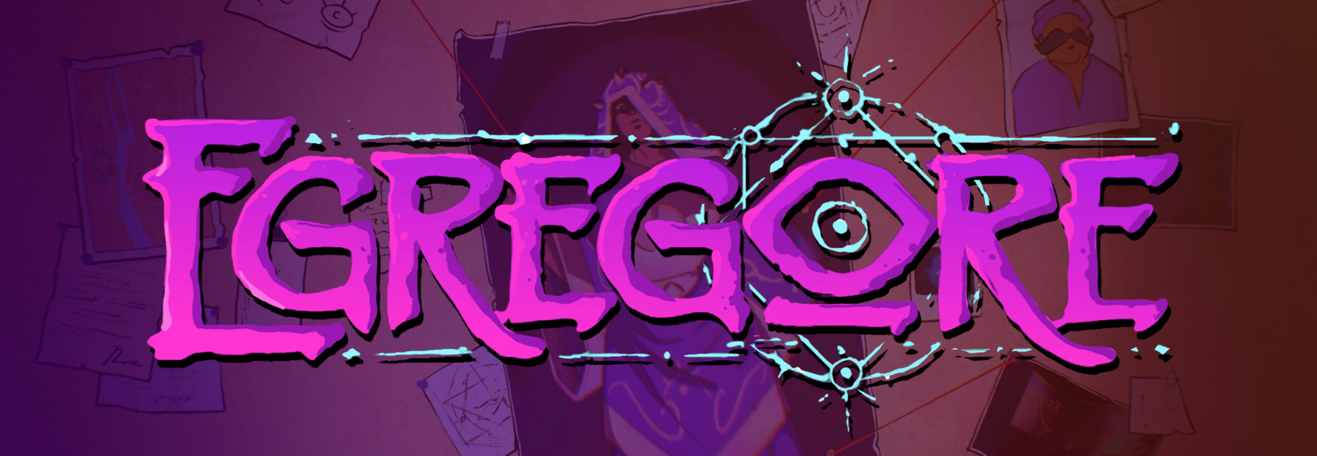
EGREGORE
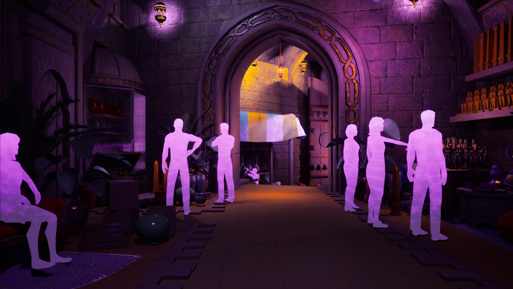
Embark on a first-person adventure to a mysterious café in Cairo. Adopt a new perspective and shape the world to your will through an experimental graph-based puzzle mechanic. Discover an occult conspiracy as you pursue a cult that aims to summon an egregore: a thoughtform that can control reality itself.
Designer
Collaborated with design and narrative teams to develop systems incorporating the core graphing mechanic and the occult narrative.
Designed non-linear puzzle flows integrated with an equally non-linear environment.
Designed, implemented, and set dressed level layouts.
Team size: 35
Spring 2023 - 24
Released on Steam in June 2024!
SHED SKIN, BLEED INK.
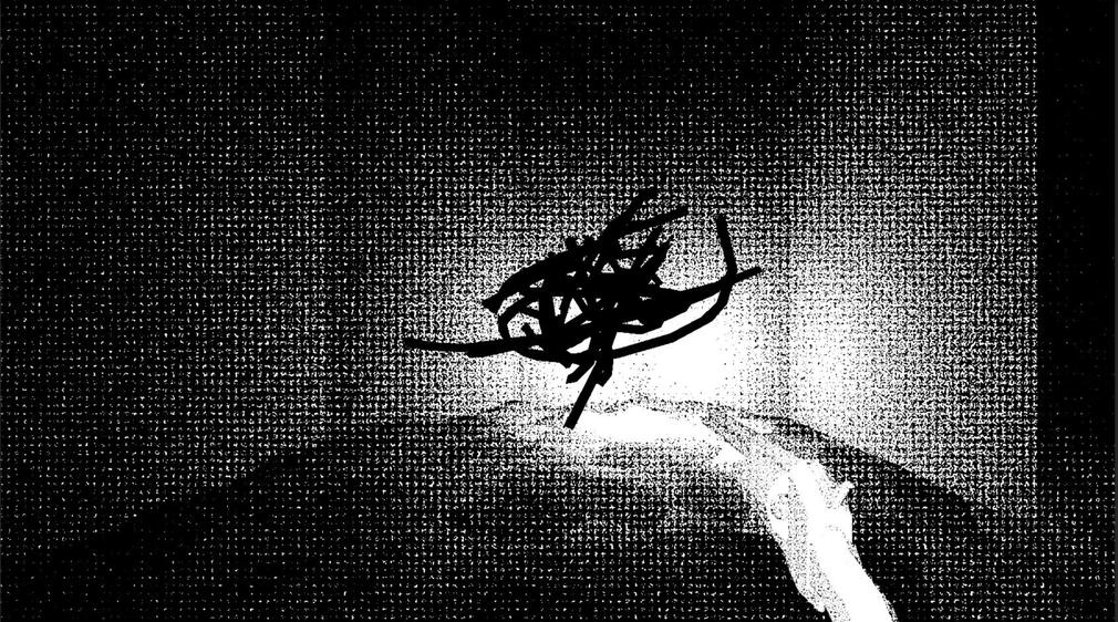
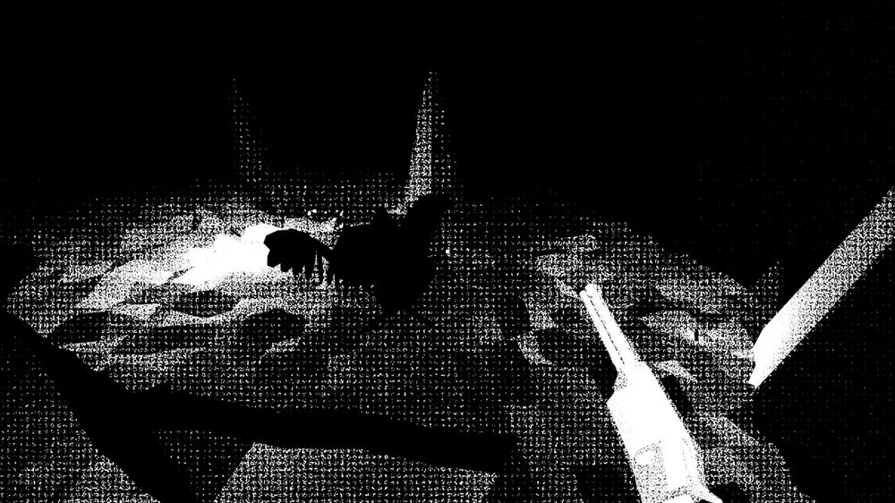
A ritual within a game. Write on your [physical] skin to embody the holy prophet of generations past, or defy the fate written out for you as your rebirth approaches.PHOTOSENSITIVITY + FLASH WARNING. PROCEED WITH CAUTION.
Co-design and programming, Art direction, UI, Narrative design, Usability.
Co-designed the game's experimental body writing mechanic over 15 weeks, rapidly playtesting to ensure usability.
Designed and implemented a custom event-based scriptable object dialogue system, wrote ½ of total in-game dialogue.
Created UI, environments, and character art, + implemented them in-engine.
Team Size: 4
Released September 2024 on itch.io!
Melbourne Queer Games Festival 2024 Awards Shortlist.
Released March 2026 on Steam!
Cards of Heart
A cozy card-battler, top-down RPG, and Cognitive Behavioral Therapy teaching tool. Play as Amalia, a young woman in the fantasy town of Respite, and help her as she struggles with defeating her inner shadows following the loss of a close friend.
Systems Designer
Designed, tested, and balanced player cards with the systems design team.
Iterated on the card battling system, including progression and enemy design.
Integrated cards as rewards for quest system.
Facilitated and documented team playtests, and used playtest data to improve system and player experience.
Team Size: 39
Spring 2023 - 24
Published to Steam + itch.io and hosted on kozee.games !
12
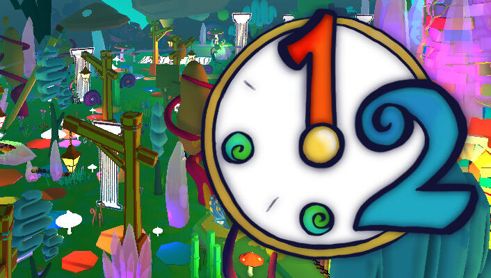
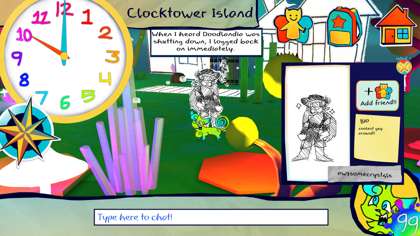
Explore the children's MMO Doodlandia one last time. Walk through the final moments of your childhood digital home until the clock strikes 12.
Co-developer, primary designer, writer, and art director.
Designed and implemented core game systems alongside a partner.
Conducted weekly playtests to improve gameplay experience.
Created and implemented UI based on classic MMO UI.
Designed, implemented, and setdressed the game’s layout and environment in Unity, and collaborated with 10+ artists to source character art.
Team Size: 2
November 2023 - January 2024
Published to itch.io!
DERAILED
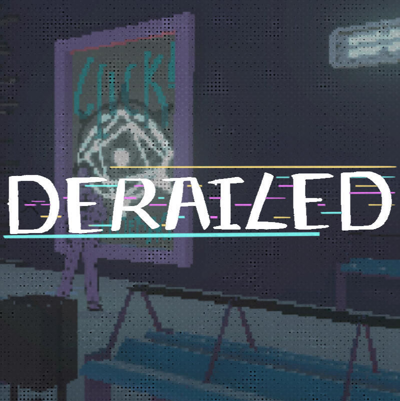
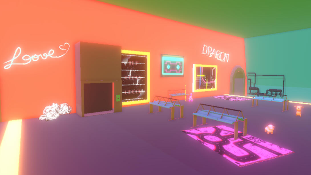
Travel through a surreal subway system and help its denizens in this walking simulator inspired by Tati's Playtime. But is your destination really more important than the journey?
Co-designer and programmer, Level and Environmental Designer
Co-designed and programmed the basis for game systems involving swapping objects and character-object interaction.
Worked closely with and directed an artist for character and scene assets.
Curated assets to compose level layouts that change based on player-NPC interaction and completion of requests.
Team Size: 3
April 2023
Published to itch.io!
BLINDSIGHTED
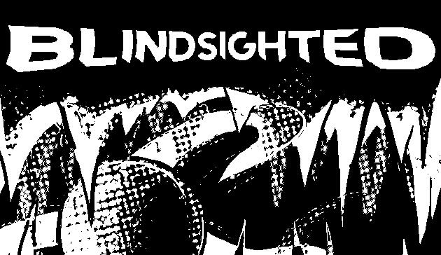
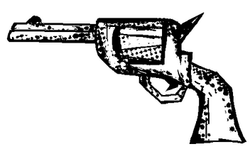
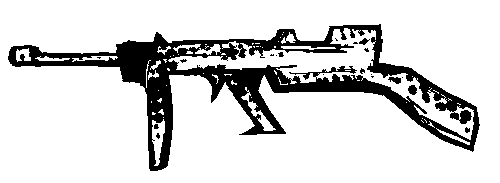
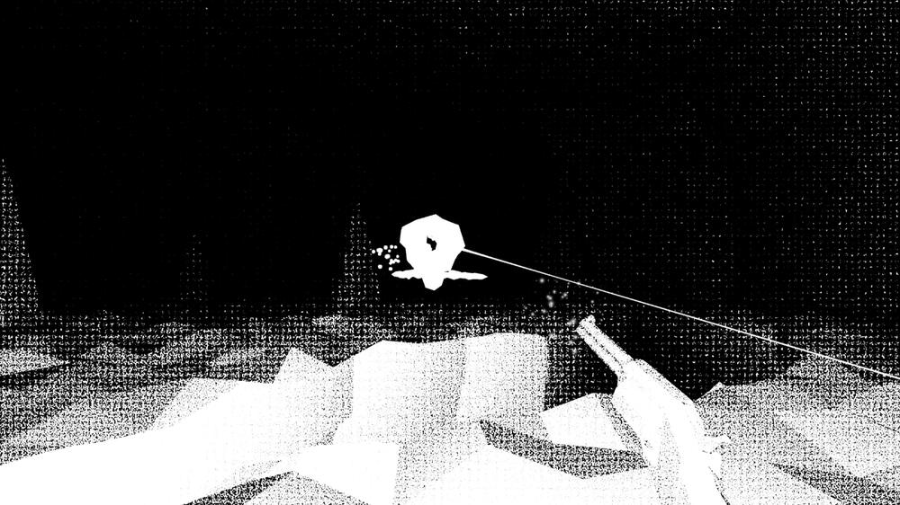
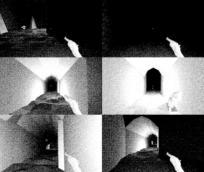
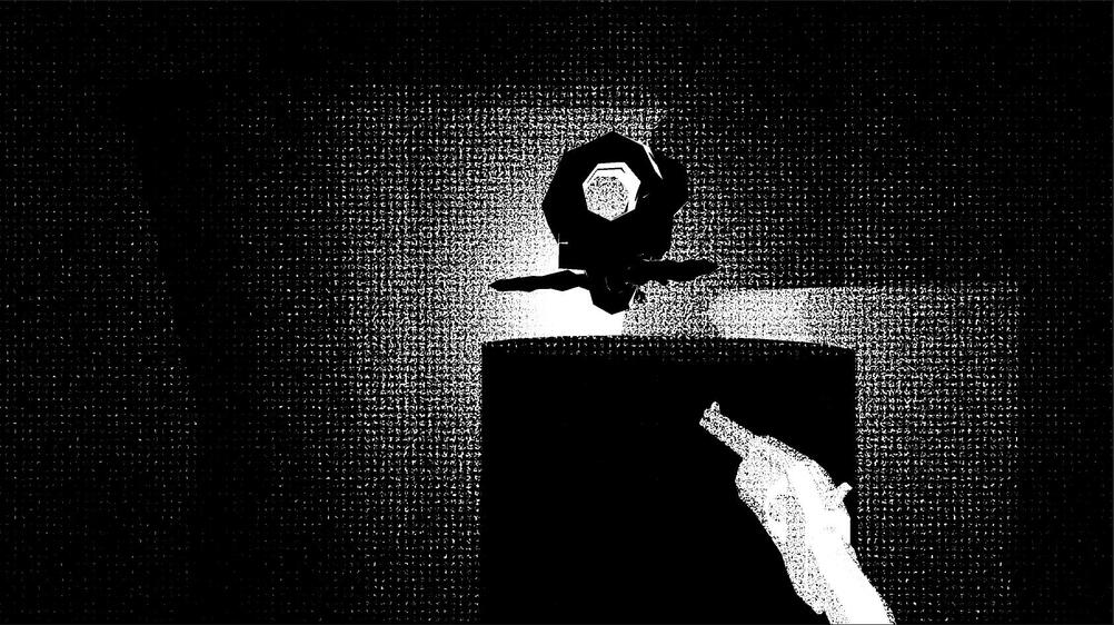
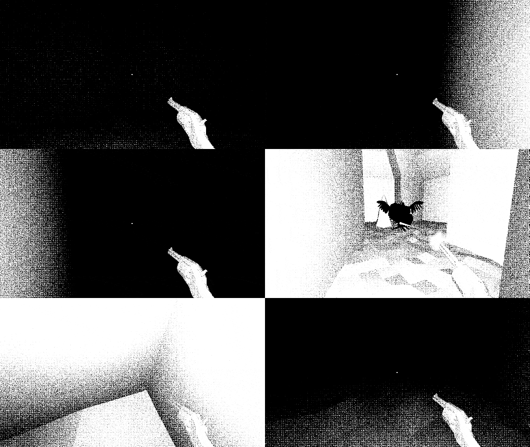
Escape your infinitely looping limbo of torment using your muzzle flash to see the demonic amalgamations pursuing you in this fast-paced first-person movement shooter.PHOTOSENSITIVITY + FLASH WARNING. PROCEED WITH CAUTION.
Gameplay + Level Designer, Artist
Wrote an overall level design philosophy based on fear, linearity, and movement.
Designed 3 of 5 level layouts.
Illustrated UI and cover assets.
Team Size: 7
Developed in 1 week during July 2022.
Published to itch.io. Placed 5th in gameplay and 10th overall in the Black and White game jam!
Minecraft + chemistry education
An individual formal research study on Minecraft Education Edition and game design for High School chemistry education.
Student researcher
Designed an experimental Minecraft- based chemistry map.
Conducted formal research playtests with 4 participants.
Analyzed data to evaluate effectiveness for High School chemistry education.
Wrote and published formal study.
Solo project for the AP Research course.
Developed September 2020-May 2021. Published July 2021.
Cited by 8 as of May 2024.Panja, A., & Berge, J. (2021). Minecraft Education Edition’s Ability to Create an Effective and Engaging Learning Experience. Journal of Student Research, 10(2). https://doi.org/10.47611/jsrhs.v10i2.1697
fire
Experimental prototype from early 2024. I wanted to communicate a choice that has weight you're unaware of: save one artefact from a burning museum, and learn what it is after.
PAPERBONES
Deeply personal dinosaur collage dress-up game. I started this in July 2023, and finished July 2024. 90% of it was complete in the first month of development, but I had trouble writing the accompanying poem.
There's a more comprehensive reflection on my itch.io, but the short version is that I got super self-concious about my own identity until I finally learned to just bite the bullet and accept how I felt about the game.
SKYGLOW
A platformer where you play as a cat returning the stars to the sky, and stopping light pollution in a coastal forest town.Made for IndieCade Climate jam 2024 as part of their game design internship program. I handled and led technical production during the jam's 5-week runtime, and programmed a lot of the game's key systems.
Our team of 9 won the Jammer's Choice award after judging!
MISSION WHAILURE
Audio-based alternative control collaborative spacewhale hunting installation! A multiplayer game emphasizing rapid communication in a physical space.
Designer, programmer, artist + co-creative director!
Drafted, designed, and manufactured custom wired alternative controllers.
Project management and co-development of a music + rhythm-based installation/game hybrid.
Rapid prototyping and playtesting game system integrated into installation to ensure a seamless player experience.
Team size: 3
May 2024-present
Created as a Directed Research project at the USC Interactive Media program, and in conjunction with a grant from the Arts and Climate Collective.
FREE SPEECH ZONE
UNIVERSITY INC. PRESENTS: FREE SPEECH ZONE
An interactive art installation - take on the role of a student navigating their future on a university campus amidst times of civil and political unrest. An examination of the history of student protests within the bureaucratic university system.
Production Designer, researcher
Conceptualized, designed, and built an installation with a team of 15 within 1 semester.
Collaborated to research for, write, layout, and produce installation narrative.
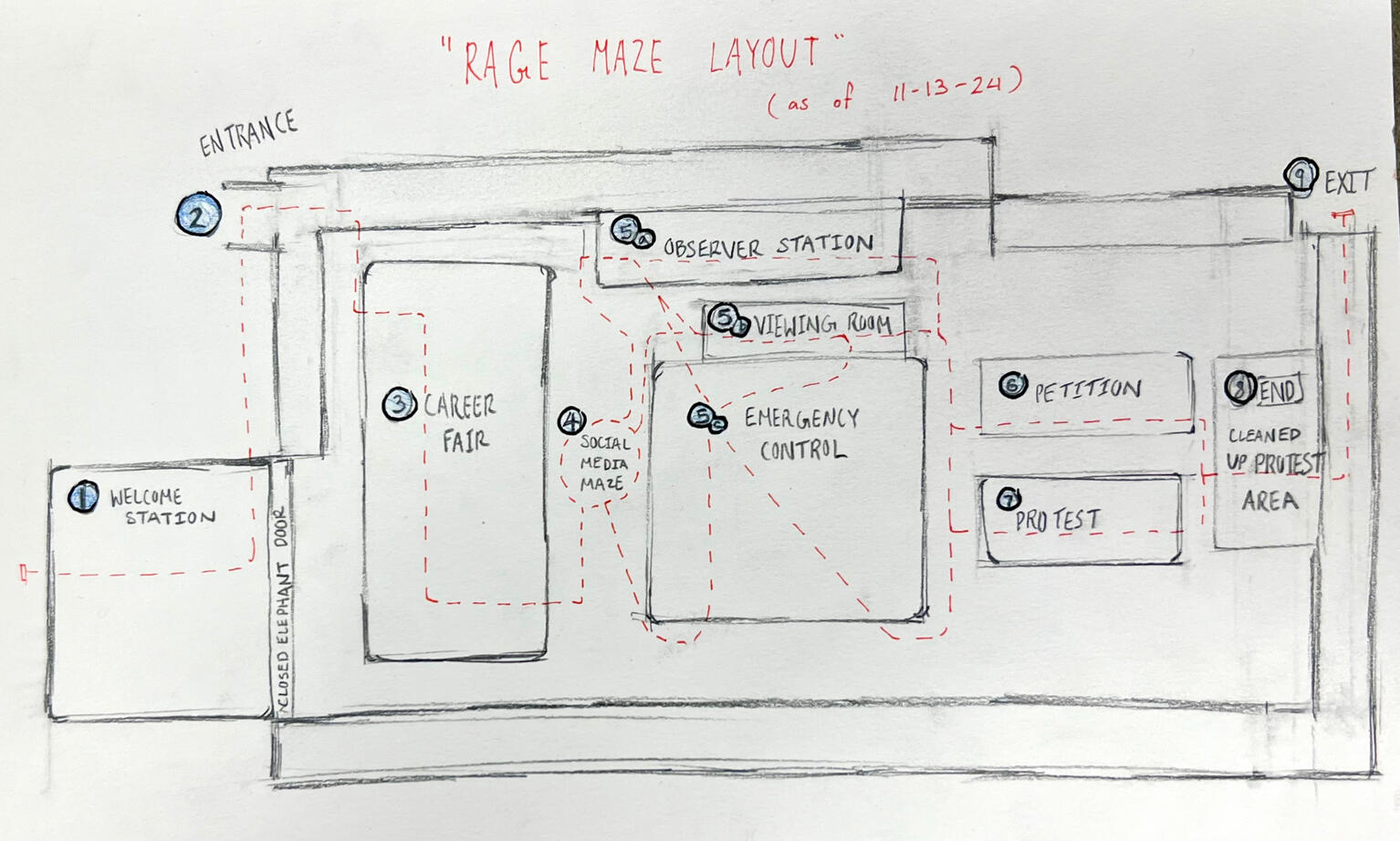
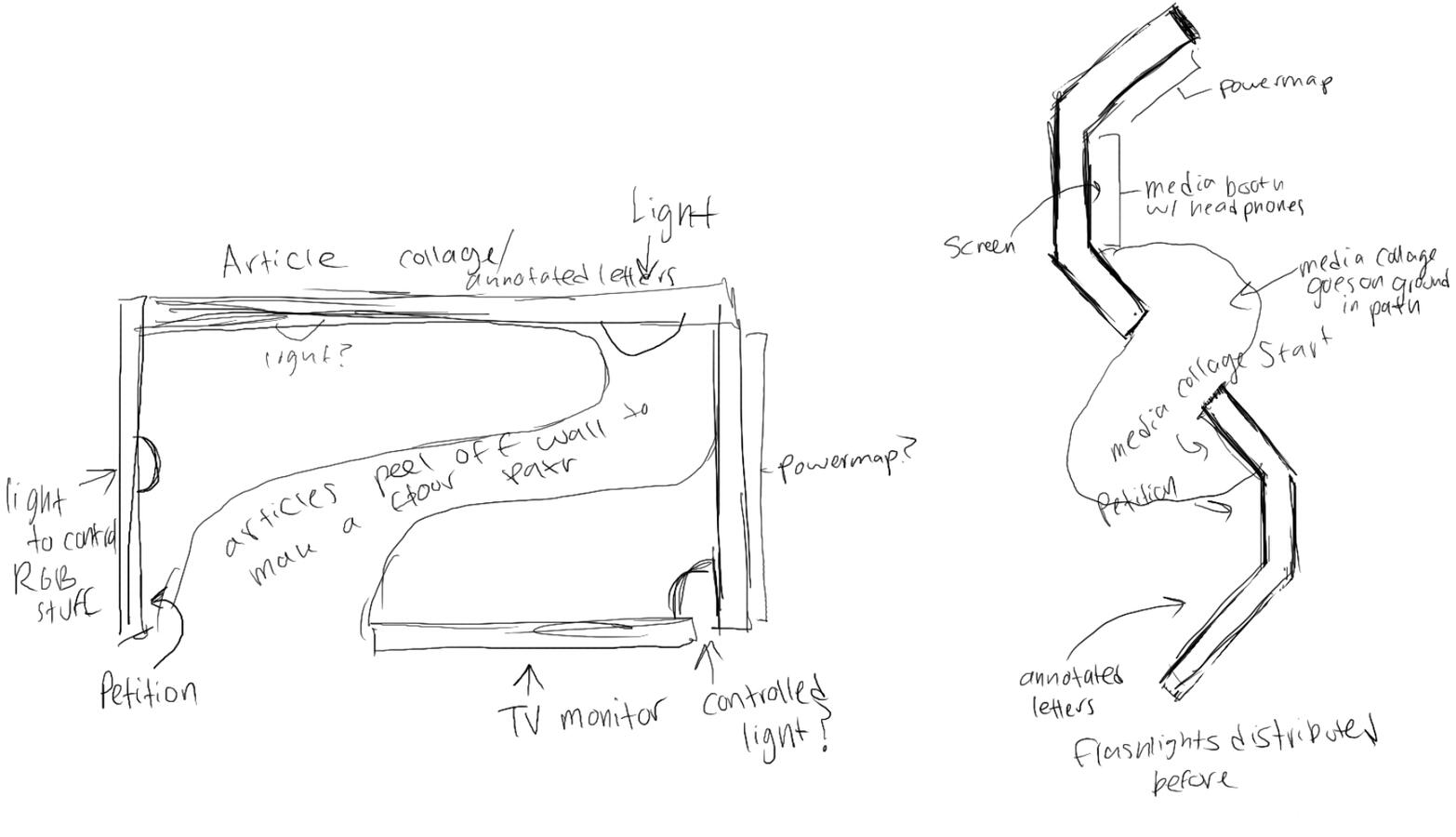
Created production layout sketches and drafts for final installation.
Co-directed and created one of the exhibit's main rooms.
Team size: 16
Fall 2024
2-night installation at the USC School of Cinematic Arts through the "Embodied Storytelling and Immersive Docu-Narratives" Course.
VR MEMORIALS SHOWCASE
Temporary installation at the LA County Hospital's Wellness Center's Día De Muertos celebration, accompanying progress on VR Memorial projects for terminal gynecologic cancer patients.
Installation design crew, programmer
Created final production sketches of installation layout from drafts and room layout.
Alongside team, conceptualized, scoped, built + tore down final installation.
Programmed VFX for VR/projected component in Unity Engine.
Team size: 25
October 2024-Present
Showcased November 1st, 2024.
Final memorials kept private for patients and families.
MISSION WHAILURE
Audio-based alternative control collaborative spacewhale hunting installation! A multiplayer game emphasizing rapid communication in a physical space.
Designer, programmer, artist + co-creative director!
Drafted, designed, and manufactured custom wired alternative controllers.
Project management and co-development of a music + rhythm-based installation/game hybrid.
Rapid prototyping and playtesting game system integrated into installation to ensure a seamless player experience.
Designed, implemented, and wrote for a custom cutscene + dialogue system.
Team size: 9
May 2024-present
Created as a Directed Research project at the USC Interactive Media program, and in conjunction with a grant from the Arts and Climate Collective.
This game was put on hold due to severe water damage in our workspace a few months ago: We're wrapping things up now, and should be fully done by May 2026!
Myself and 2 of my friends set out to put together an experimental audio-based installation-game hybrid over the course of a year. We're currently working with 2 wonderful professors to make this project a directed research course in the USC Games program, and are funded by the Arts and Climate Collective.
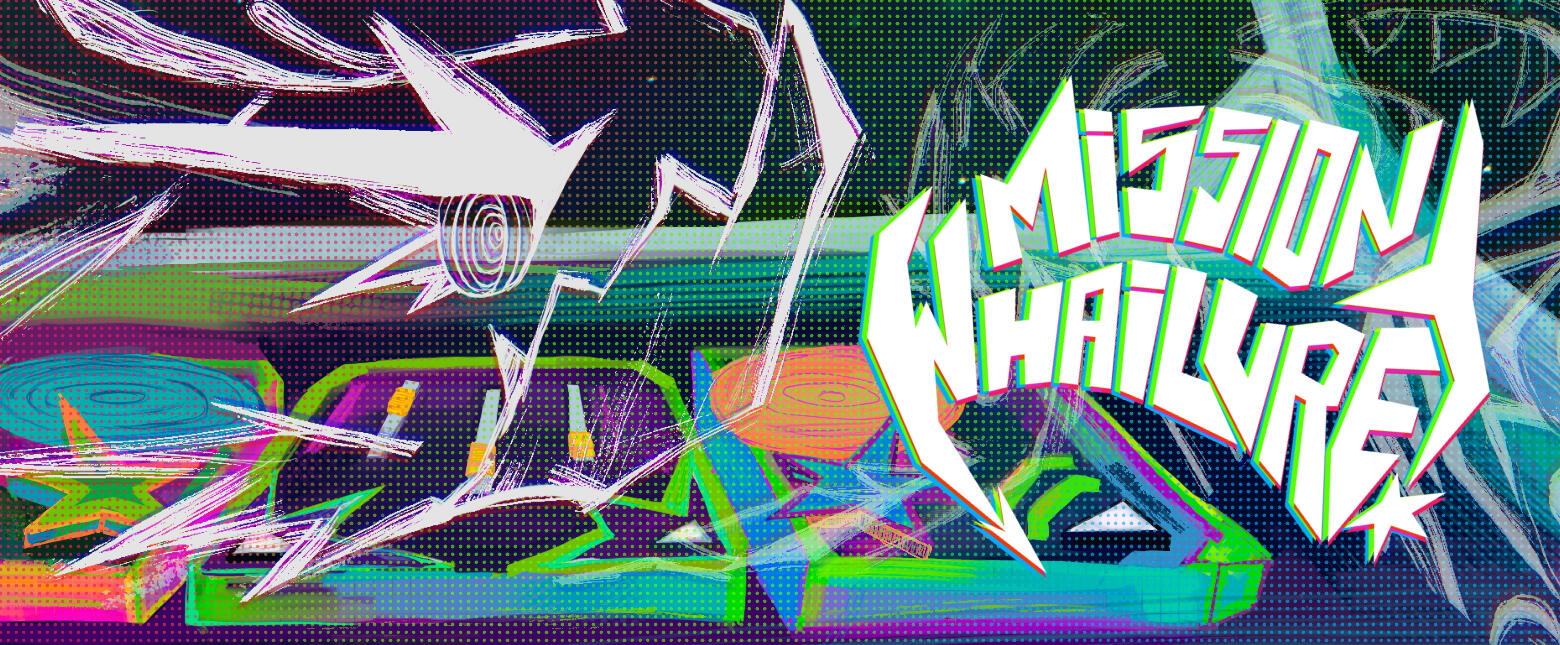
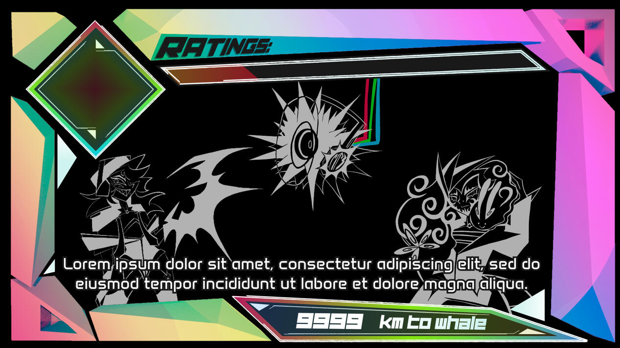
In a bizarre faraway galaxy, play as a crew of scrappy hunters for hire hoping to make a quick buck hunting an elusive Radiowhale for the...interesting Emissaries contracting you.Together, your task is to listen for and interpret the whale’s musical calls and compose your own response to disguise your ship as a fellow whale and manipulate its actions!
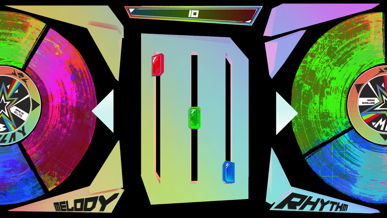
Players "DJ" to communicate with the whale, selecting tracks and filtering them to harmonize with its musical calls.Each player is in charge of 1 controller, and therefore one part of the song. All 3 of you must communicate to decide how you want to manipulate the melody, rhythm, and filters of the song you send back to the whale. If the whale likes it, it'll come closer! But if it doesn't... you might lose your chance to kill it.
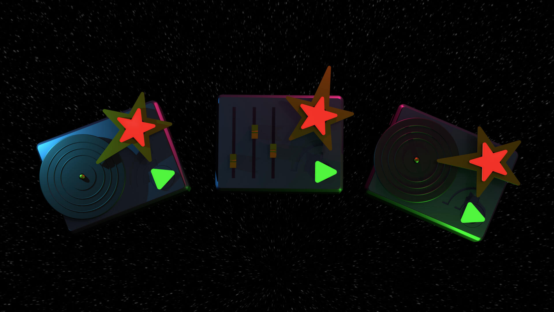
A render of all 3 controllers. The left controls the melody, which must correspond to the whale's rhythm. The right controls the rhythm, which corresponds to the whale's melody. If the whale likes your tune, it'll come closer. If not? It'll move further away.
The central controller is in charge of filters - match the whale's flanger, distortion, and volume to gain an additional movement bonus in whatever direction it's heading in!
SYSTEMS
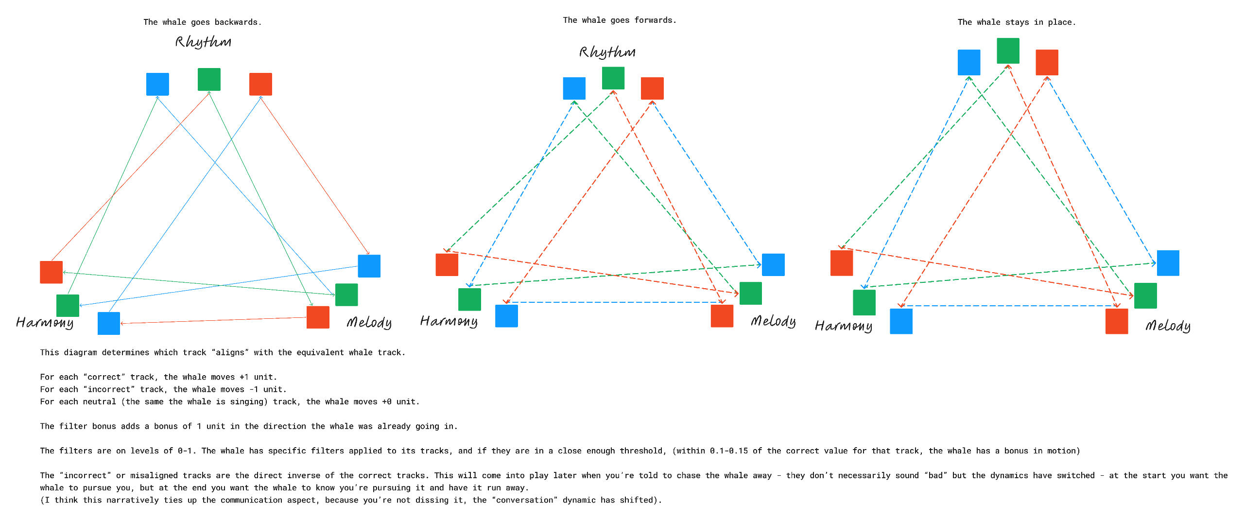
I was primarily responsible for the game's music communication mechanic, working with my partner + our composer to create a system that was both musically satisfying and easy to onboard players to.We rapidly prototyped, playtested, and iterated the system until we settled on what we're using today.
NARRATIVE
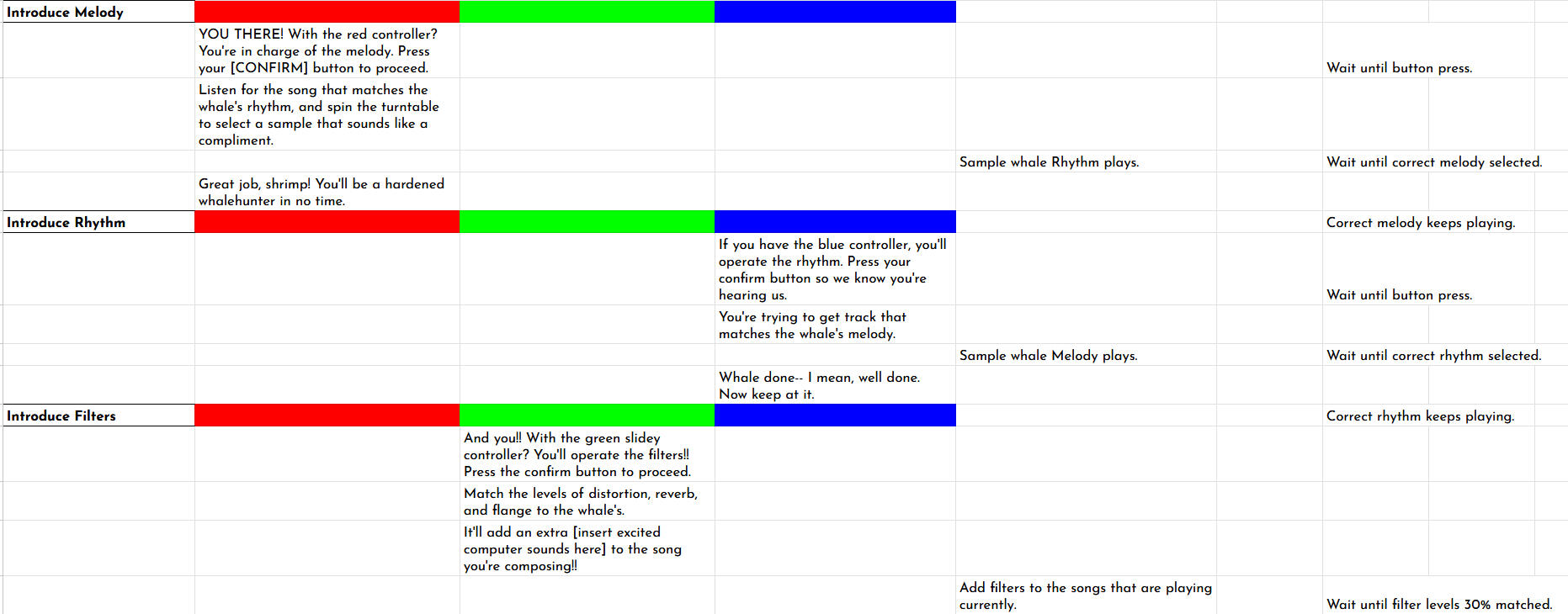
I wrote dialogue for 4 NPCS + directed voice actors, documenting lines via spreadsheets.The biggest challenge was tutorializing a complex system while showcasing distinct personalities and escalating stakes through NPC feedback.Narrative was heavily ingrained with the game design: we built a wacky, musical, satirical world that tells a profound story about situational complicity as much as our system does.
UI
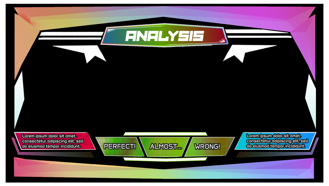
UI needed to be 2 things: readable and maximalist. This was pretty difficult at first:
However, using pre-rendered 3D models for the borders and vector/illustrated images for points of interest worked with our playtesters! These began as
I repeated the same process for the rest of the game's screens, ensuring they were readable while still maintaining the maximalist flavor we desired.
VR MEMORIALS SHOWCASE
Temporary installation at the LA County Hospital's Wellness Center's Día De Muertos celebration, accompanying progress on VR Memorial projects for terminal gynecologic cancer patients.
Installation design crew, programmer
Created final production sketches of installation layout from drafts and room layout.
Alongside team, conceptualized, scoped, built + tore down final installation.
Programmed VFX for VR/projected component in Unity Engine.
Team size: 25
October 2024-Present
Showcased November 1st, 2024.
Final memorials kept private for patients and families.
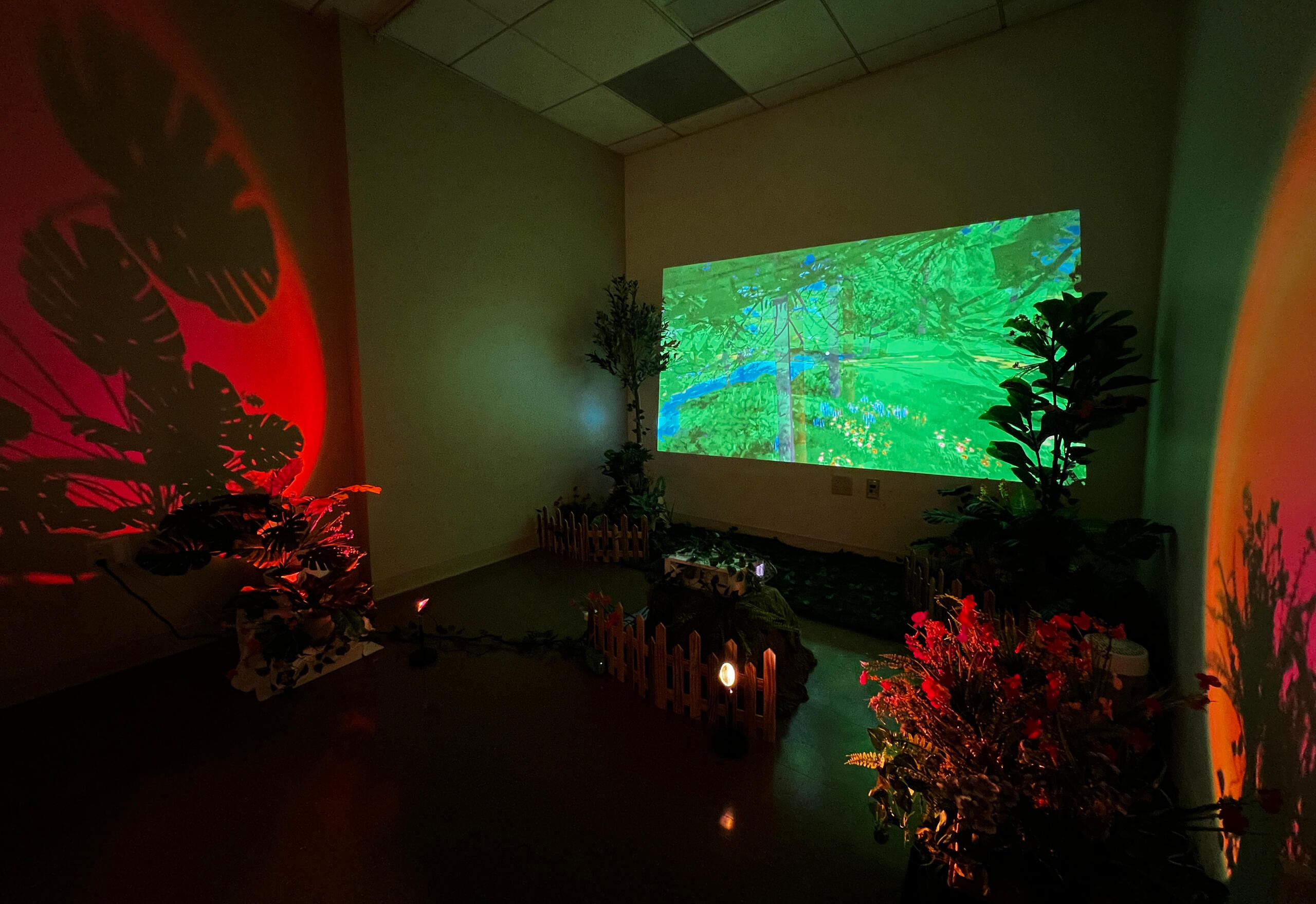
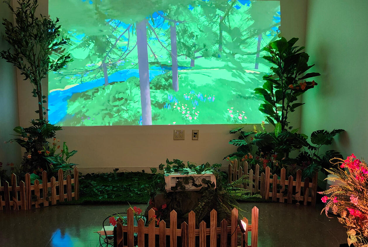
The garden room with closed-door lighting. This is how most guests would view it.
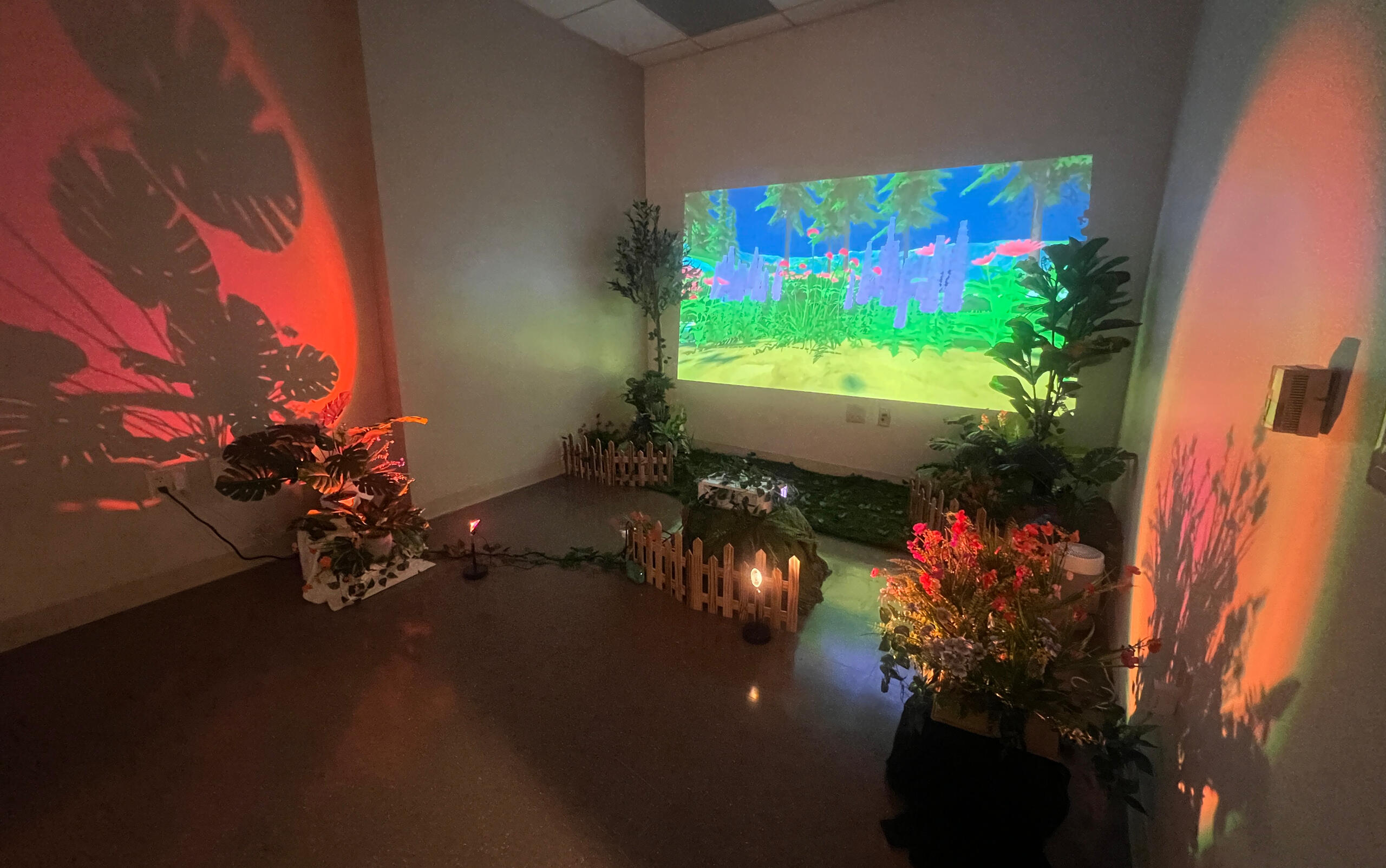
The room with the door open. The box behind the fence hid the projector setup, and was hidden from where guests stood/sit.
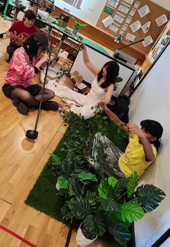
As we were working with a pre-built space in a hospital, we designed the installation to be easily set up, taken down, and transported. We also had a limited timeline (around 2 months) to develop both the VR memorials themselves and the installation. I am very proud of what our team put together, and I am looking forward to working on the remainder of this project with them.
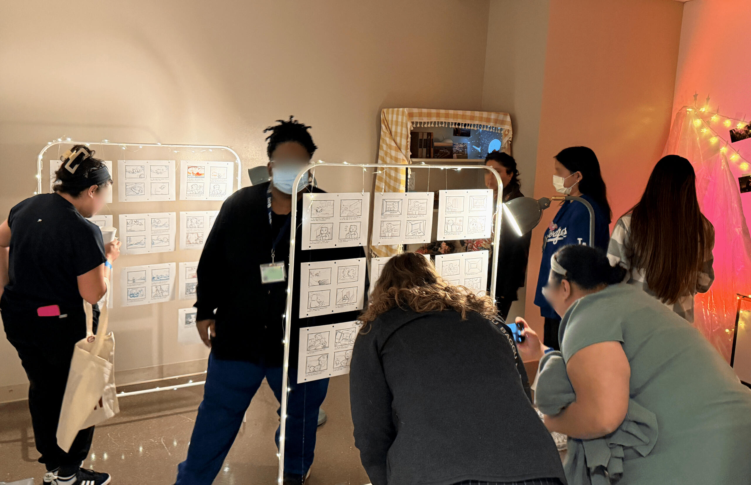
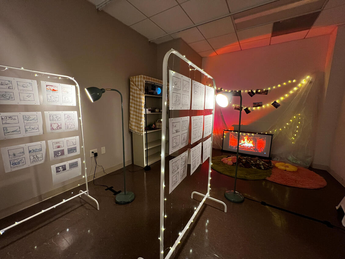
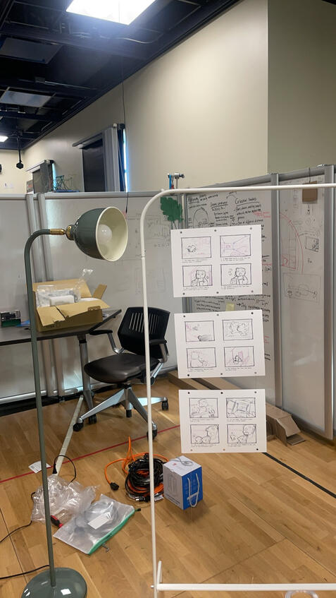
Guests took a circular path around the room to view the storyboards. This photo was taken with the door open, so the lighting is not accurate to the installation.
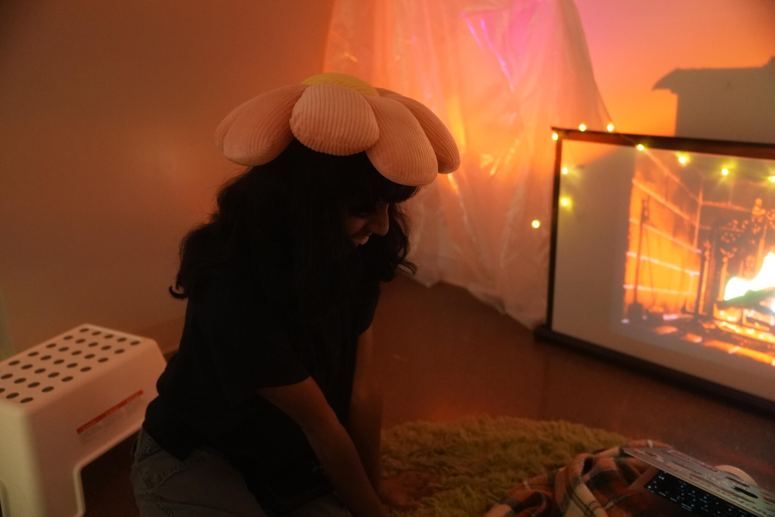
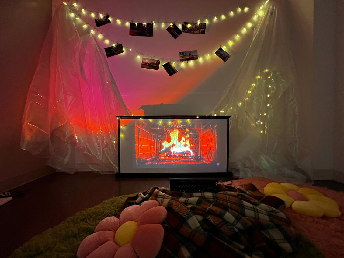
Sitting by the fireplace.
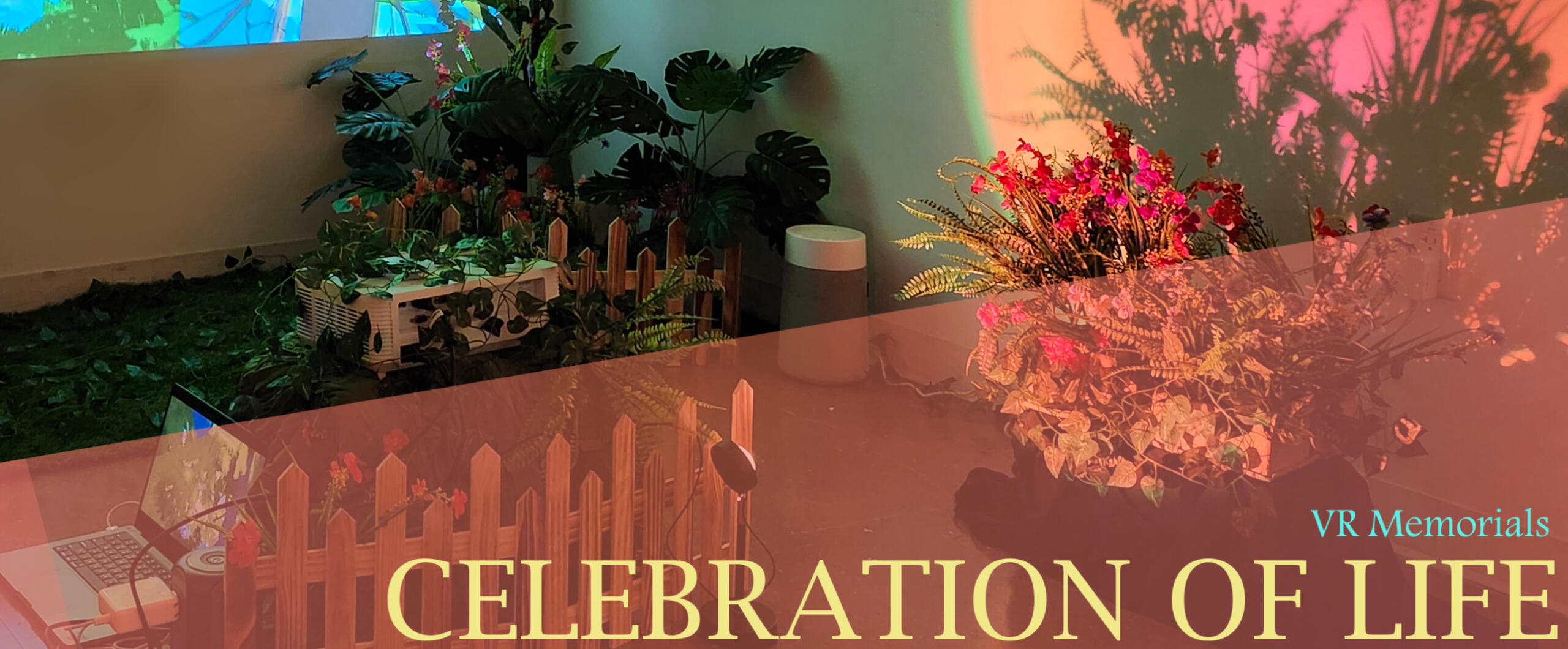
The "Celebration of Life" showcase was an event showcasing progress on the Virtual Reality Memorial for Gynecologic Cancer Patients project, where the Creative Media and Behavioral Health Center's collaborated with terminal gynecologic cancer patients to create digital memorial experiences.This showcase on Día De Muertos was both a display of project progress and a thank-you to the patients and doctors we were working with. Due to the nature of these pieces, the material I can share publicly on them is limited.Along with the rest of the lab, I participated in memorial and installation brainstorming, production, and development sections.
For the Celebration of Life showcase, I created final floor plan drawings based on my teammates' layouts, sketched setpiece designs, and assisted10 of us met at the Wellness Center on November 1, 2024 to set up, attend, and strike the showcase.There is currently a permanent mini-installation at the LA County hospital featuring the digital memorials.
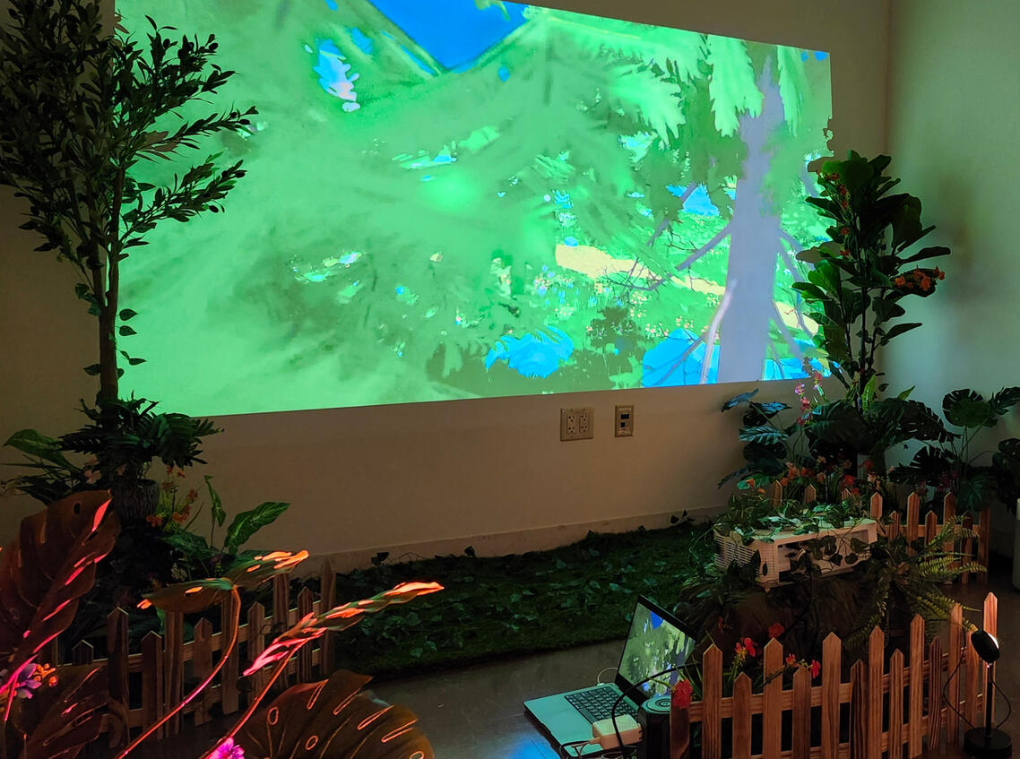
The first room was garden themed, with a projection of a recorded playthrough of its respective VR memorial. We designed an open garden space for guests to sit and watch the recording - a sequence putting them in the eyes of a caterpillar transforming into a butterfly.

We first tested the first room's layout and lighting in the Creative Media and Behavioral Health Center lab.

Front-on view of garden/projector setup.

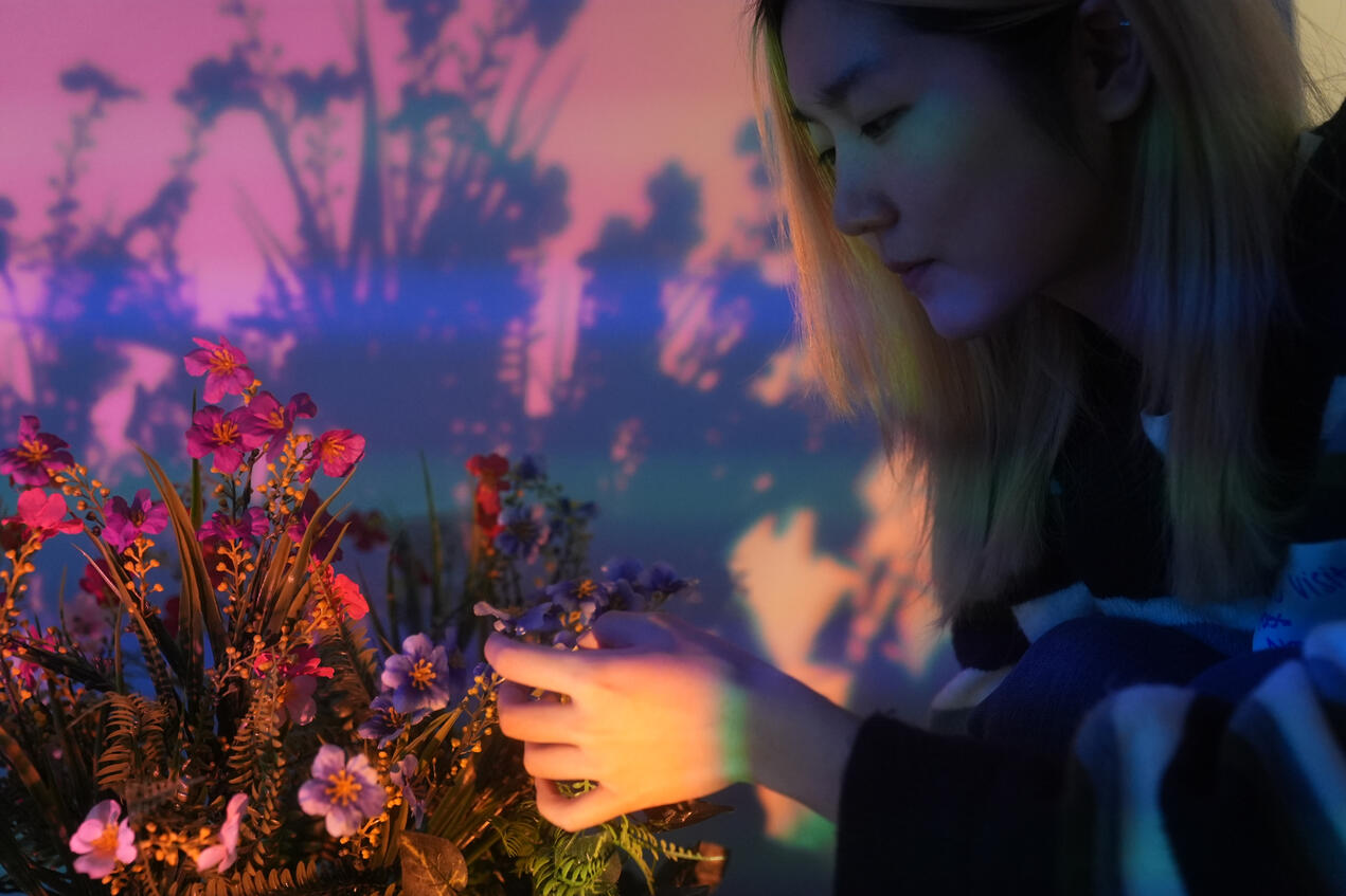
The first memorial we showcased was through the eyes of a butterfly, so we used artificial flowers and plants to create a "garden".

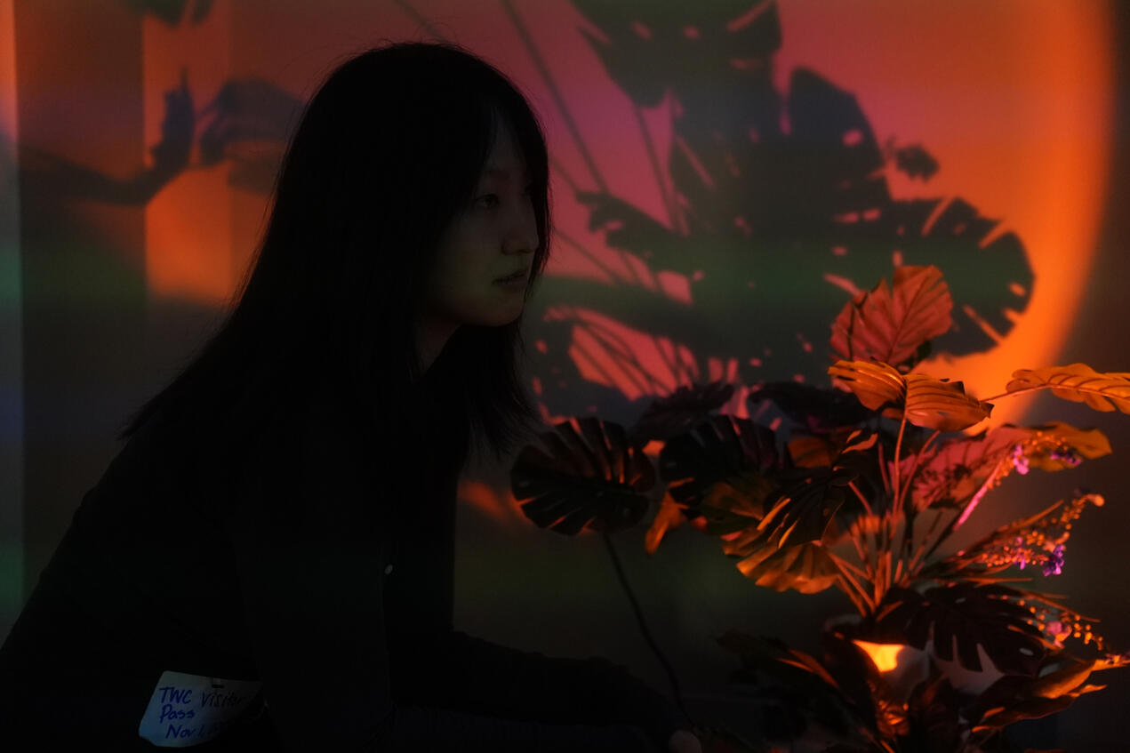
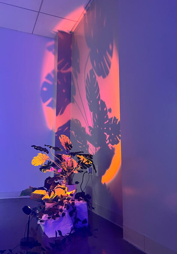
Small floor lamps were placed to create dramatic shadows on the walls.

Full view of one of the lighted plants.

View of the garden with the projector setup - the laptop is plugged into the projector elevated on top of a mound.
Not seen here are the scented oils applied to flowers to create a garden-like atmosphere.
Since this room hosted a video played on a timer, the space was designed to have guests in one location until the video ended, and to immerse them in the dreamy world of the memorial's butterfly garden.
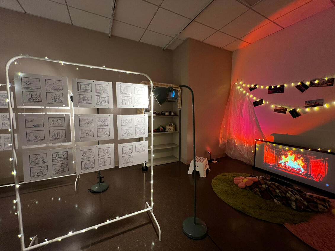
The second room housed animation storyboards, and had a cozy atmosphere. The memorial it showcased told the story of a mother bear and her 3 cubs, and we wanted to make it feel like their home.

The "living room" sitting area in the back of the second room. Concept art for the animation is hung from the fairy lights above the projector.

The full room, with the storyboard stands acting as "hallways".

Another angle of the full room. Iridescent fabric was used to create a dreamy atmosphere.

A test of the fishing line hanging the memorial animation storyboards in the lab.

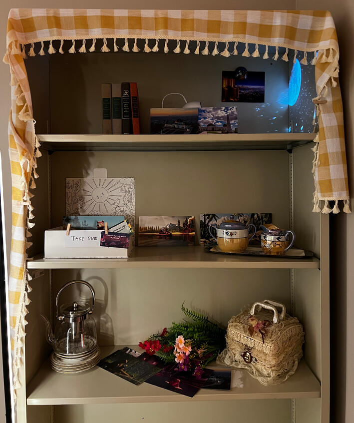
The shelf on the left side of the room. The room lights are on here, making it difficult to see, but the night sky is projected on the top. Each shelf represents something from the life of the patient this room housed.
We used limited seating and separated the storyboard displays to keep movement constant throughout the room. The space was limited, so we had to ensure people were going in and out.
FREE SPEECH ZONE
UNIVERSITY INC. PRESENTS: FREE SPEECH ZONE
An interactive art installation - take on the role of a student navigating their future on a university campus amidst times of civil and political unrest. An examination of the history of student protests within the bureaucratic university system.
Production Designer
Conceptualized, designed, and built an installation with a team of 15 within 1 semester.
Collaborated to research for, write, layout, and produce installation narrative.
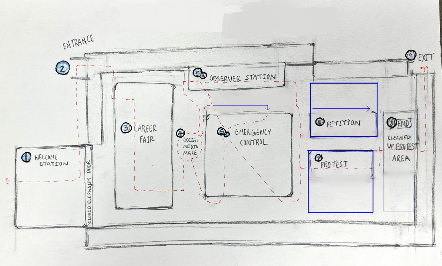
Created production layout sketches and drafts for final installation.
Co-directed and created one of the exhibit's main feature rooms.
Team size: 16
Fall 2024
2-night installation at the USC School of Cinematic Arts through the "Embodied Storytelling and Immersive Docu-Narratives" Course.
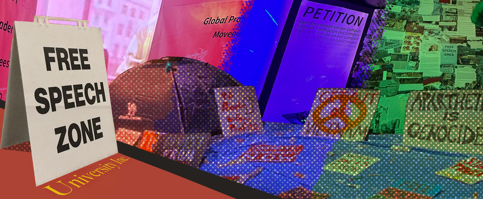
Universities have historically been a place for social change. How does that operate within a university bureaucracy?"Free Speech Zone" is an outlet provided by "University Inc." for free expression. Don't worry, you're allowed to say and do whatever you want as long as it doesn't lose the University money!We intended to question what kind of free speech is allowed at a private university at USC, and how universities function as private corporations and academic institutions simultaneously.
Critiquing the university as an institution was a risk at USC, but from a research and artistic perspective it was ultimately worth it. Rather than looking at the present, we decided to focus on a the historical role of Universities in global protest movements.
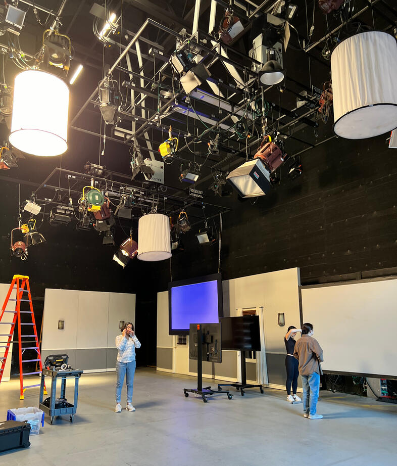
I'm still waiting on official photos of the installation! Below are a few my teammates and I took.
A feature-by feature explanation of the installation will be available alongside these photos.

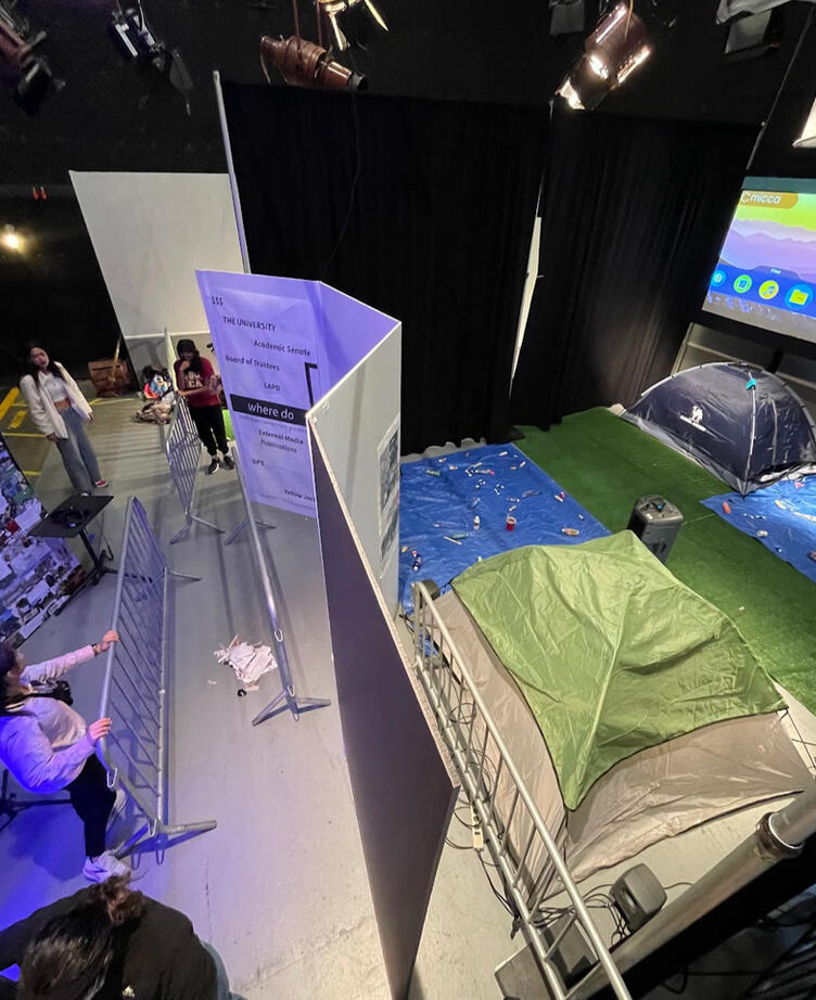
The inside of the Observer station.

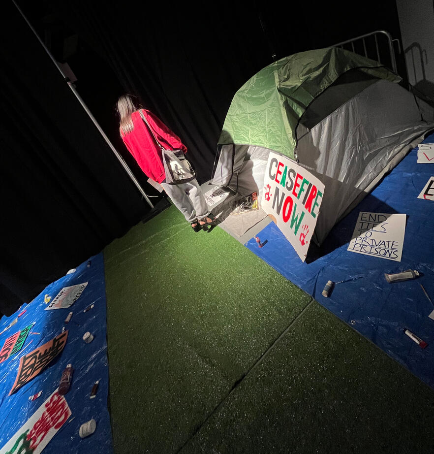
A student walking through the protest section. We recreated signs from historical university protests.

Taking down the petition and protest sections.

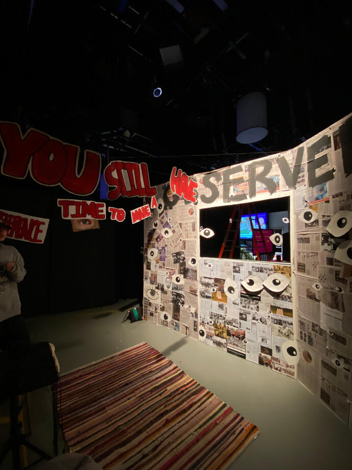
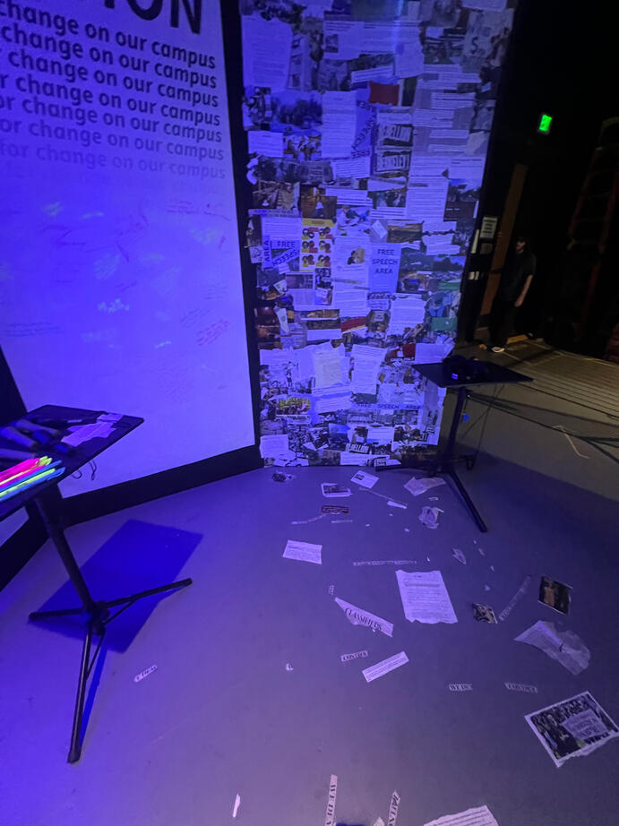
Full media collage with path to the video wall I assembled using newspaper clippings, online articles, and archival materials.
The first few weeks of the class were spent brainstorming and discussing installation content. After debate, we reached a consensus - we wanted to focus on rage and institutional bueracracy in the context of a University. "Rage Maze" was our working title for a while, as we wanted to play with space, frustration, and branching choices.Our research focused mainly on the University of Southern California - as USC students, it seemed a natural place to start. While USC remains prominent academically, the power and money connected to it can't be ignored when considering the decisions it makes as an institution. What is the University's interests? Do they serve their students, or something else? And whose interests is it obligated to follow? In our installation (done through a class at, and displayed at USC), we aimed to bring the false dichotomy of the University as an academic/corporate entity to light.
We spent much of the semester conducting intense research, and refined a narrative based on that research. Initially, we had 3 "roles" guests could take - staff, faculty, and students. I was part of the team responsible for drafting the student path, and represented them in story design sessions. We eventually refined the narrative to focus on the students, and created the final exhibit layout based on it.
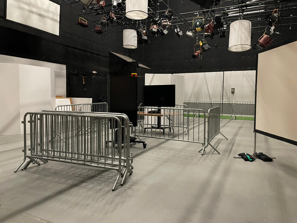
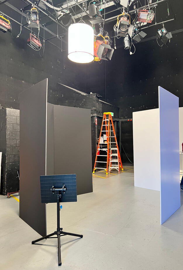
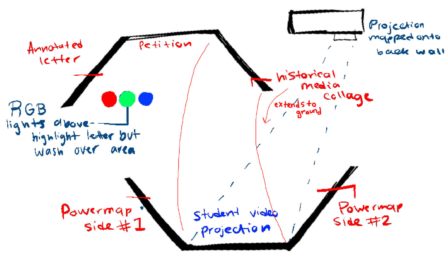
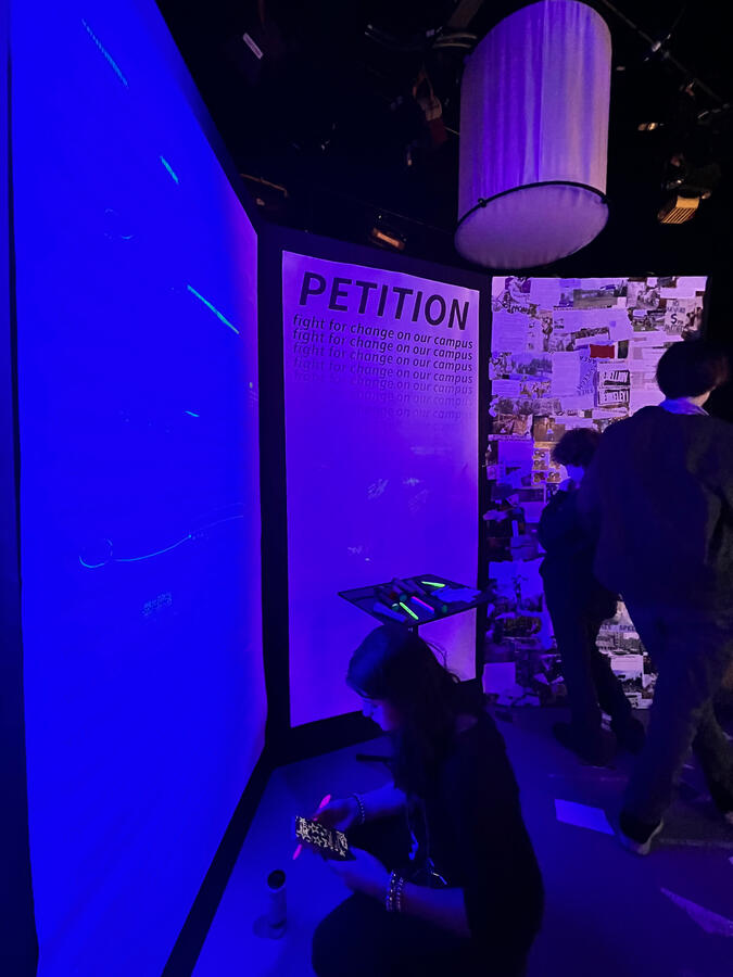
We were working with 5 different features, so we created a 6-wall design out of foam core to feature them all. My teammate Jasmine, and I, developed a RGB light-based interaction as this room's focus, "shedding light" on the University's hidden tactics to suppress student activision and enforce their agenda.The petition was the focus of this room: guests who chose this path over the protest were doing things the "right way" according to the system, but we wanted to make it clear that the University would not act against its financial and bureaucratic interests in the face of social change.
We positioned red, green, and blue LEDs over the room, and annotated the "President's letter" and powermap with highlighters. Turning each light on individually revealed a single highlighter color (Blue showed yellow, green showed pink, and red showed blue). A table had flashlights modified with red/green/blue color gels guests could pick up to shine on the room's walls.This brought to light different perspectives commenting on the letter - the whole story was only revealed when you worked with another guest to reveal the hidden colors.The color of the light periodically changed, focusing on a different perspective with each color.
Guests were also provided yellow/pink/blue highlighters to make their own annotations across the room, and "sign" the petition.This worked exceptionally well - save for a few annotations made by Jasmine and me, the walls were almost entirely blank. By the time we met to strike the installation, the room was nearly covered in writing. This included petition signatures, connections on the powermap, annotations on the letter, humorous caricatures on the media collage, and statements of frustration about our own university's bureaucratic practices.

The left side of the room contained an annotated letter from the president, a petition, and a media collage.

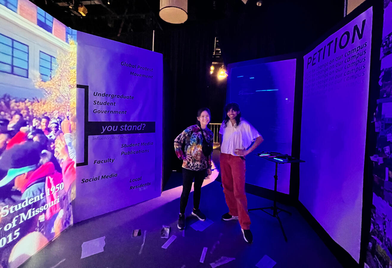
My teammate Jasmine and I in the petition room!

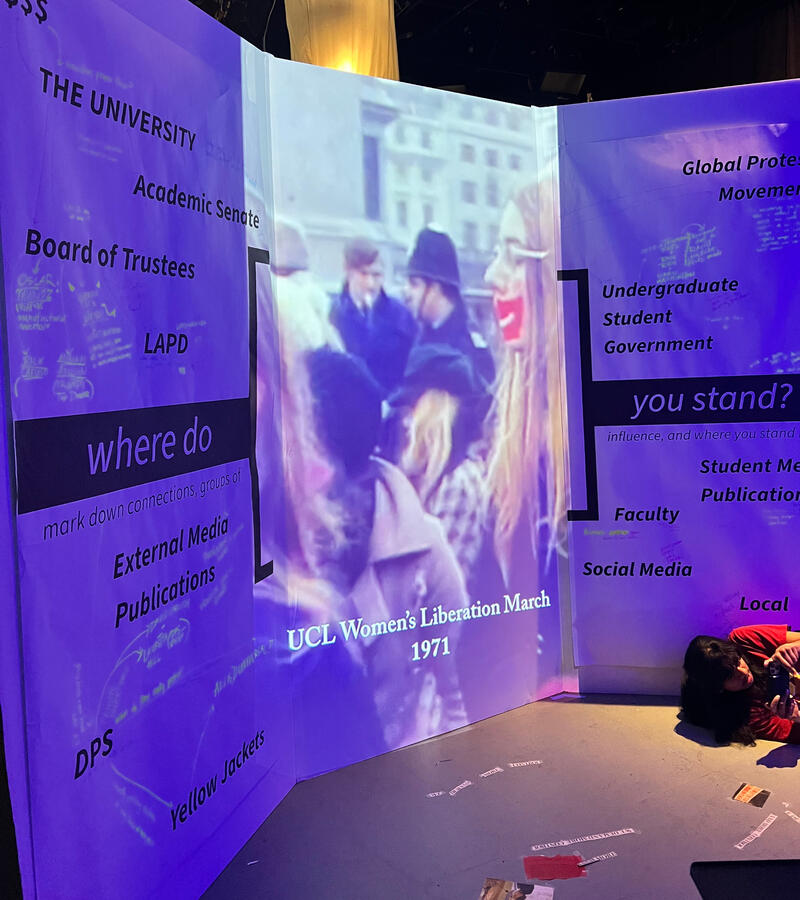
The right side showcased a video on the history of student protests in the center of a powermap inviting guests to mark "where they stand" among the university's entangled power systems. Featuring me in the corner.
I'm an undergraduate student pursuing a BFA in Game Development and Interactive Design at the University of Southern California + minoring in Media and social change. At school, I volunteer at USC's Creative Media and Behavioral Health Center as a design researcher, and make a bunch of other cool things, most of which you can see on this website.I like making "weird" things work: gme a design question and I won’t rest until it’s answered. I love diving deep into spreadsheets or spending hours blocking out levels to figure out how to bring something unexplored to fruition.I’m obsessed with creating elegant, simple systems that allow for deep emergent experiences, and creating unique gameplay that challenges how players interact with the rules of the game or with one another.No matter what I'm doing, being the best designer I can be means I'm experimenting and having fun.Outside of games, you can find me making zines, playing Taiko, bridging the gap between community members, researchers, and creatives on a Cedars Sinai advisory board, and upcycling clothes and jewelry.
(why ampheraptor? my initials are "AMP" and I'm secretly a robot dinosaur.)
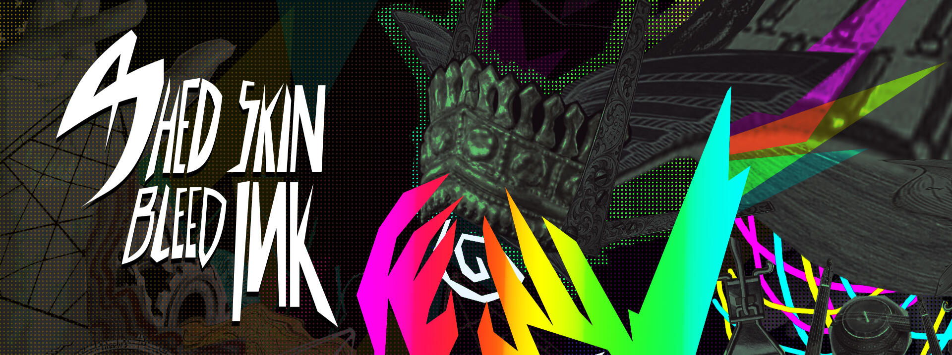
SHED SKIN, BLEED INK.
A ritual within a game. Write on your [physical] skin to embody the holy prophet of generations past, or defy the fate written out for you as your rebirth approaches.
PHOTOSENSITIVITY + FLASH WARNING. PROCEED WITH CAUTION.
Co-design and programming, Art direction, UI, Narrative.
Co-designed and tested the game's experimental body writing mechanic.
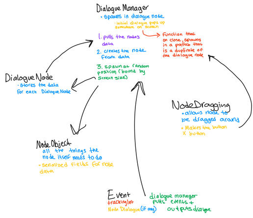
Designed and implemented a custom dialogue system using scriptable objects.
Designed UI and dictated the game's art direction.
Team Size: 4
Released September 2024 on itch.io!
Melbourne Queer Games Festival 2024 Awards Shortlist.
Released March 2026 on Steam!
WHY?
Shed Skin, Bleed Ink is a weird game. It's hard to describe because "experimental" isn't a genre with a lot of precedent, and as for other games that make you write on your skin, I can only think of one. While this game involves finding an identity of your own, we started with shame.Ink stings. Writing on your skin damages it, and once you've written something, it can't be erased (until you have soap or water, that is).
What if making the "wrong" choice in a game was something others could see? Would your choices be different if they had a physical consequence? And how could we push players to submit to a system that wasn't controlled by the game itself?This was a very personal and important game for both of us. Identity wasn't even in our original themes - it started as a museum curation game. But our narrative went through several revisions, and the curation of the museum we imagined in our original drafts transformed into curation of the self. It seems obvious in hindsight: like our Professor Peter Brinson said, we were "doing the body" and forcing players to consider the physical + real consequences of their actions. I wanted to see someone get physically transformed by the game.
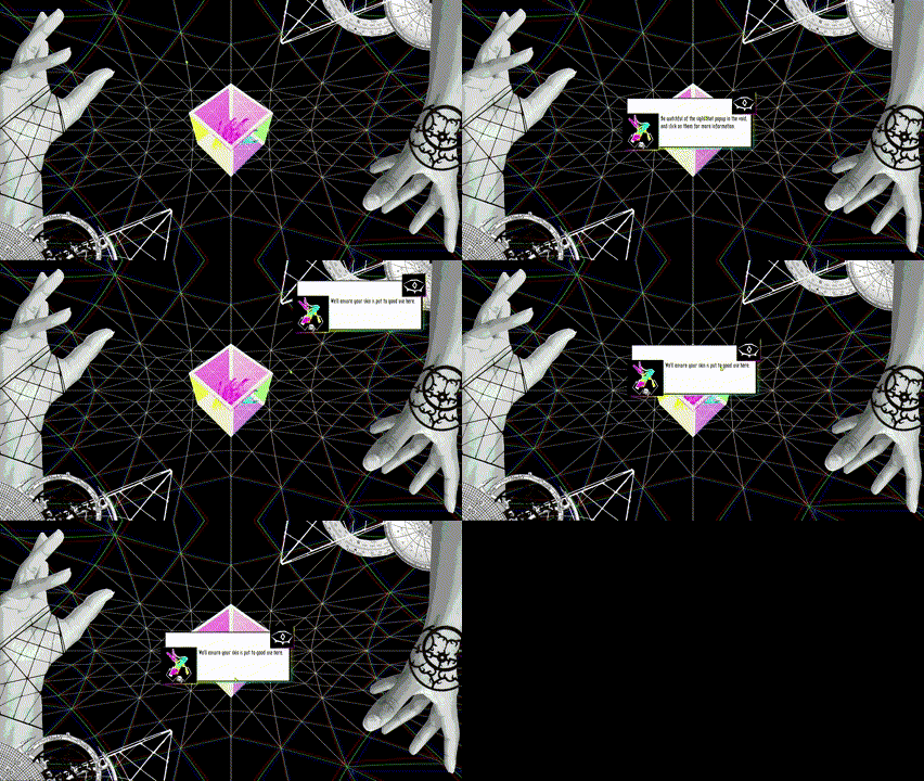
Your journey starts in the Observatory, a digital repository storing the tradition of a Prophet reborn many times over to achieve a greater purpose.For the Observatory, I designed and implemented a custom dialogue system through scriptable objects. This was the basis for the game's hefty event system.Players view dialogue in the Observatory through pop-up windows (fed dialogue upon spawning through Dialogue Scriptable Objects), which appear on screen through a list of Event SOs. This allowed dialogue to be tied to in-game events, and change as the player's favor with the Observatory evolved.
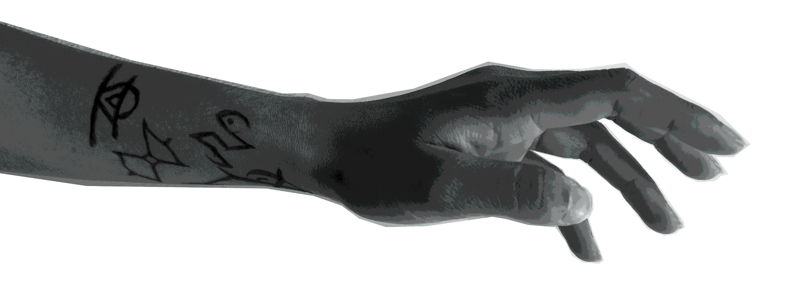
How do we judge a player for actions taken outside the game?Through weekly iterative playtesting, we aimed to teach abstract evaluation of the sigils players write on their skin.
But what if you choose to disobey the Observatory's prescription for your identity?
The Observatory requires that you, the player, write sigils representing the life of the previous Prophets on their skin.Alongside my teammate, I designed the intermittent surveillance system the Observatory uses to track whether the player is inscribing sigils according to their guidelines.Each sigil is assigned a value based on what it represents to the Observatory.
The player's favor increases/decreases based on whether they evaluate things according to the Observatory's guidelines.
The values of the Observatory are arbitrary, and require narrative investment to understand.This forces players to self-surveil themselves. The more they're engaged with the Observatory's system, the more they follow the game's rules.
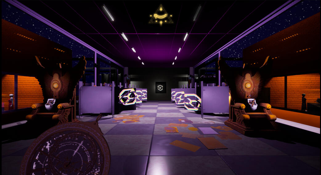
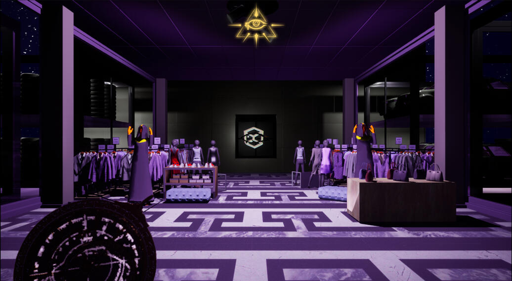
Sigils appear around the Observatory, and players must be vigilant in writing them all down.The Observatory prompts you to evaluate the sigil based on its percieved value. Mistakes result in having to slash out certain sigils or parts of your skin.
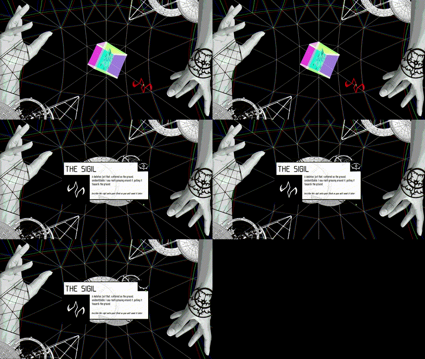
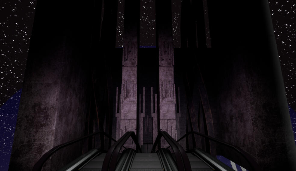
Clicking on their own sigil brings players to the Wasteland, a nonsense space and the manifestation of the desecrated bodies of prophets past.
I was responsible for the Wasteland's layout, visuals, and inhabitants.
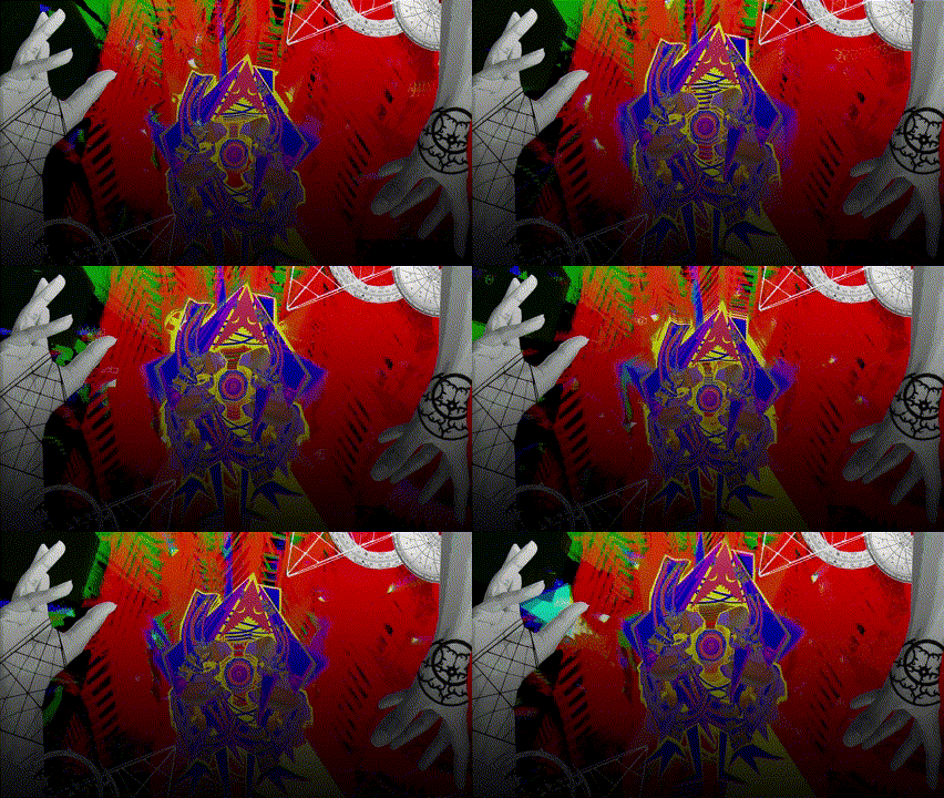
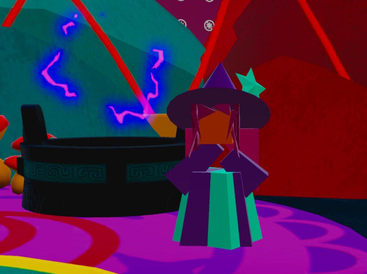
I exploited Unity's shader graph and skyboxes to create the abstraction you see in the Wasteland.
The resulting effect is a space that appears chaotic at first, but on an aesthetic level that allows players to navigate it.
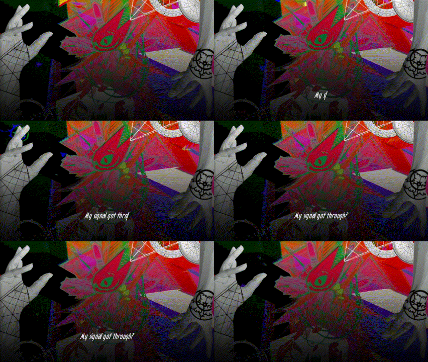
Previous incarnations of the Prophet, representing different parts of the body and associated emotions, speak to you about the true meaning of the sigils in a last-ditch to break the cycle of reincarnation.
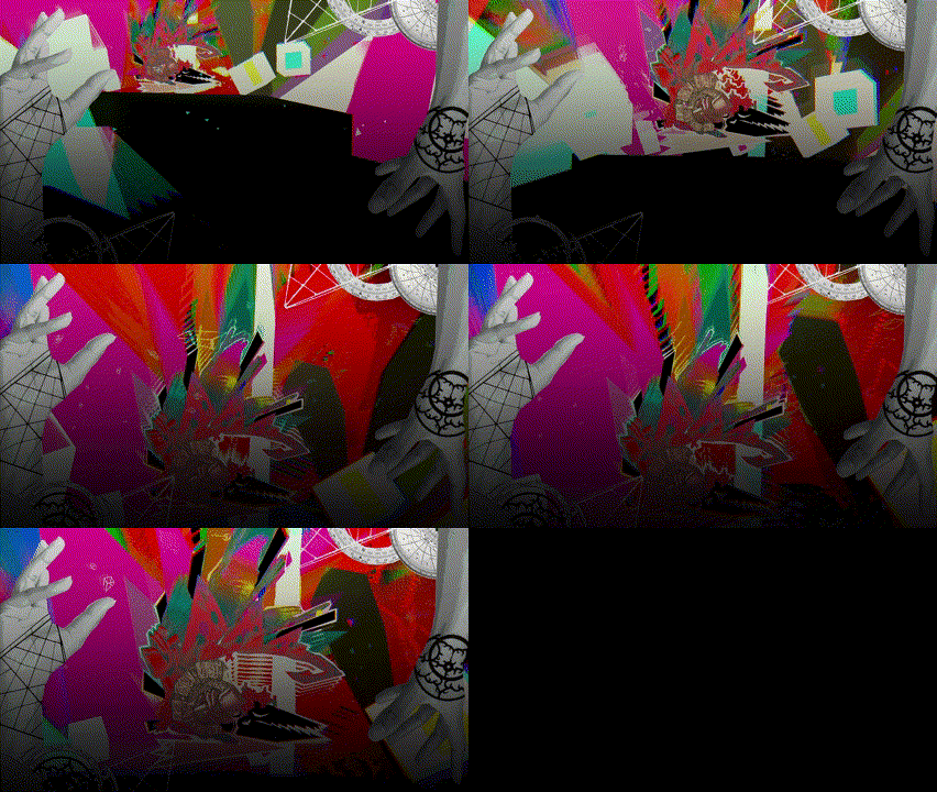
Each character, once they are ready to speak, prompts you to create a sigil of your own, representing your own emotional journey. Will you trust them above your orders from the Observatory, and risk desecrating your skin?

You.

Eyes.

Heart.

Lungs.

Guts.

Mind.
The chaos of the Wasteland was purposeful - we wanted to convey that it was painful, almost to the point of impossibility to traverse. This might've worked a little too well - most playtesters were able to figure out what to walk on without falling, but enough fell off on accident that I would've added some safety rails if I did this over again.
Weirdly enough, the trippy skybox was a result of losing development time due to a medical emergency. I needed something quick that did a lot, and since it did a lot visually, it eliminated the need for any other visual noise.
EGREGORE
Embark on a first-person adventure to a mysterious café in Cairo. Adopt a new perspective and shape the world to your will through an experimental graph-based puzzle mechanic. Discover an occult conspiracy as you pursue a cult that aims to summon an egregore: a thoughtform that can control reality itself.
Designer
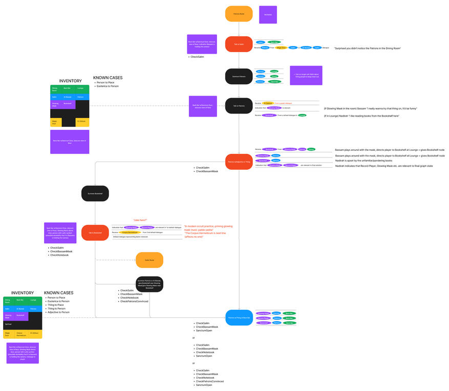
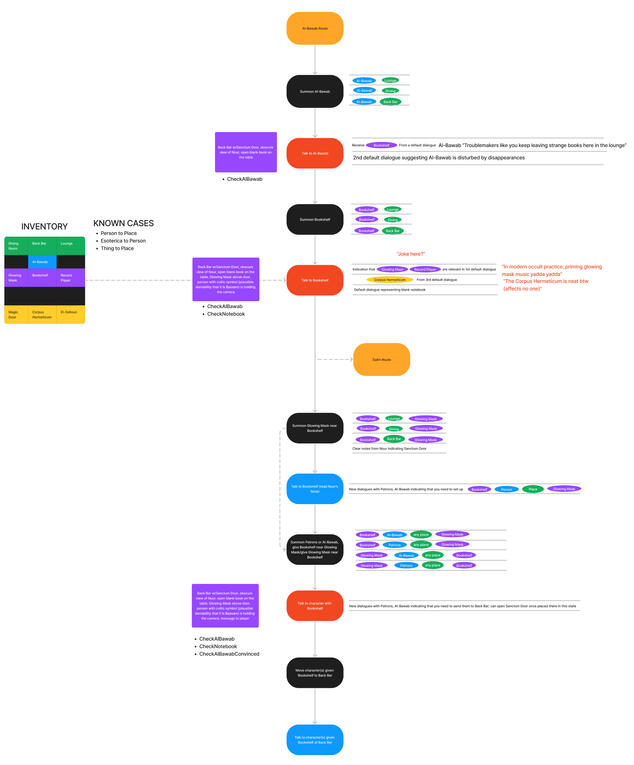
Collaborated with design and narrative teams to develop systems incorporating the core graphing mechanic and the occult narrative.
Designed non-linear puzzle flows integrated with an equally non-linear environment.
Designed, implemented, and set dressed level layouts.
Team size: 35
Spring 2023 - 24
Released on Steam in June 2024!
Game trailer, from the USC Games Expo on May 7th 2024.
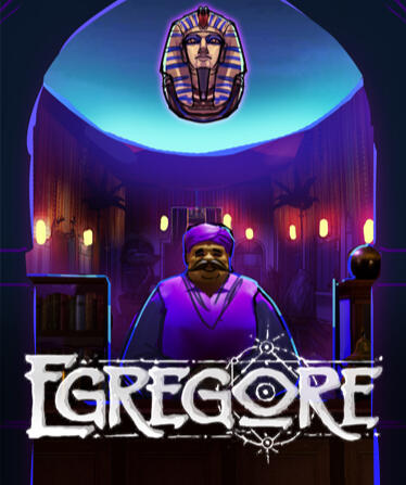
An adventure game both evoking and subverting genre classics, Egregore utilizes an experimental mechanic in which players connect nodes in a graph to change the world around them.
I was a designer in a team of 35, working on core systems, level layouts, and puzzle flows. We were met with an incredible reception at this year's USC Games Expo, and both those familiar with the genre and not were pleasantly surprised by the graphing mechanic.
My work:
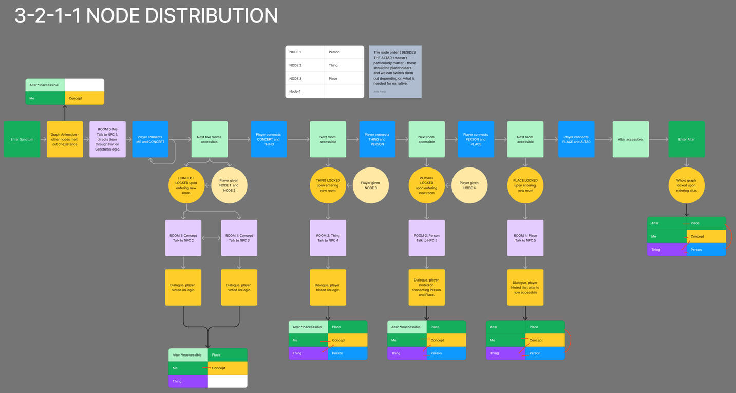
Over the year, I developed all 3 major sequences (tutorial, Café Ramses, and Sanctum) and the graphing system they use alongside the design and narrative teams.
Here's a few sample puzzle sequences I worked on. Hover over/click them to learn more.

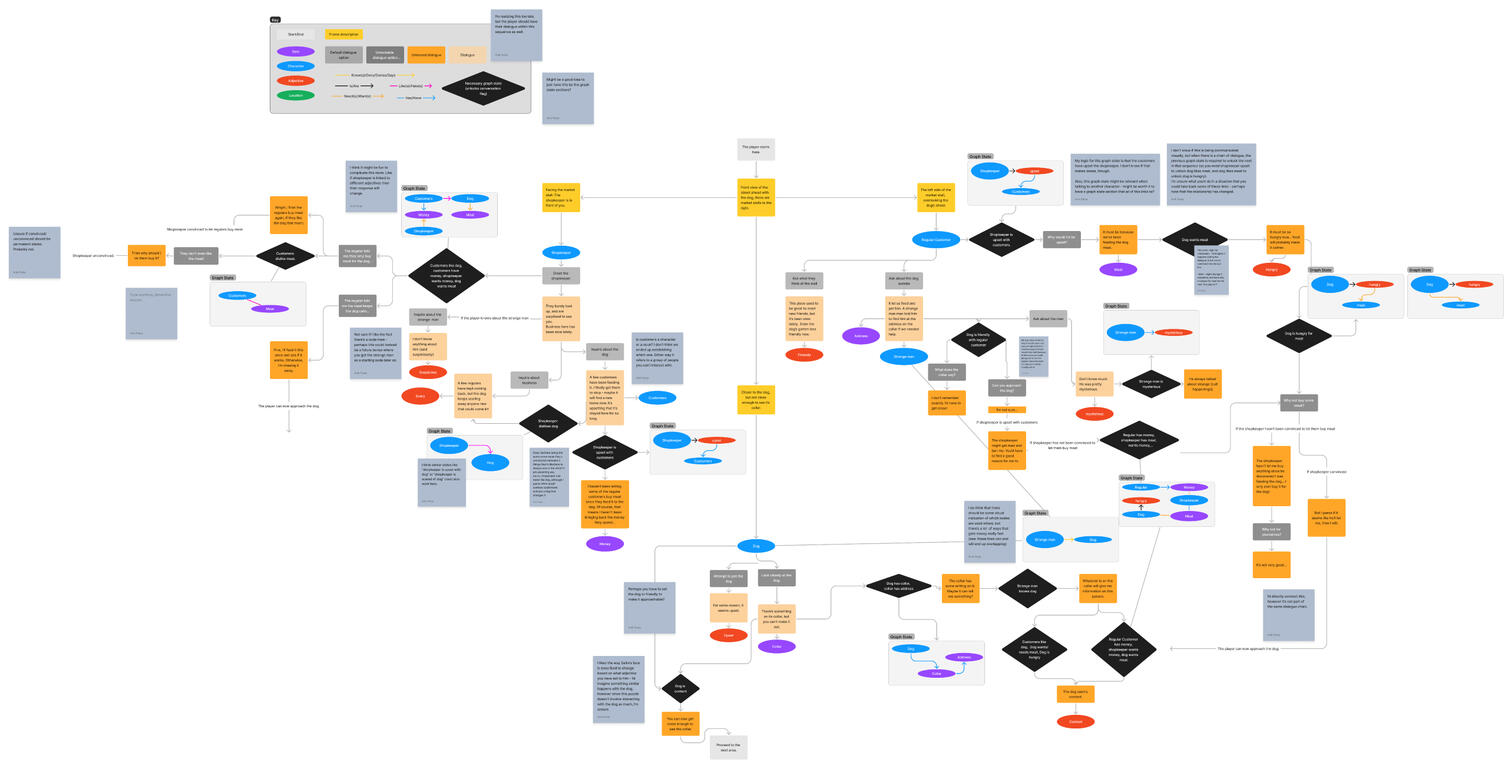
I was responsible for drafting out a sample sequence for puzzle flows. I created this one in July, which was heavily informative to how we designed following puzzle sequences.

A splice of the sequence draft for Café Ramses, the main area of the game. This approach eventually became too convoluted, and the design team and I pivoted for a simpler way to document puzzle flows.

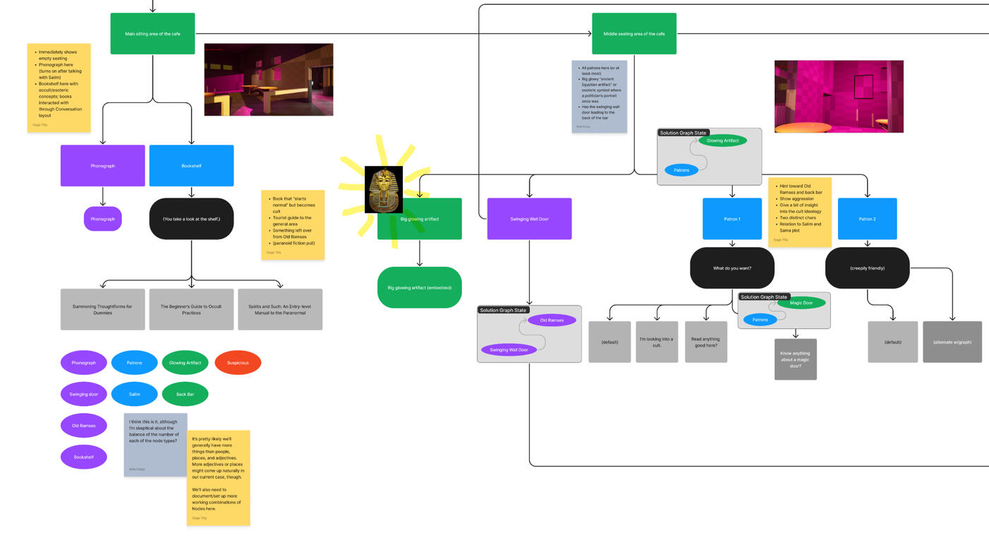
An updated and simplified draft of one of Café Ramses' branching routes.

Another Café route. Note the switch from branching solutions into a more curated list of solution states.

An alternate draft of the final sanctum sequence. This was intended to be more straightforward, constraining the player to strict rules contrasting the sandbox-like gameplay in the café.
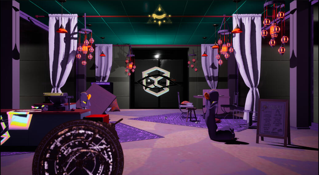
Sample setdressing for the "linear" Sanctum sequence.
The goal was to create an unsettling cult-like environment in an abandoned mall, an eerie mirror to the lively Cairo streets.
I was responsible for iterating puzzle sequences and creating alternate puzzle flows. During development, we scoped down from a more freeform version of the graphing system to one that requires the player to hit certain checkpoints for "routes".I designed what evolved into 2/3 of the final Café routes, and continually recieved feedback from the lead designer in their development. Together, we revised these sequences to create the final Café Ramses puzzle.Additionally, I blocked out early revisions of the Cairo streets and Café Ramses in-engine, and updated them as puzzle sequences were finalized.This allowed the design team to make the environment appropriately dynamic for the reality-altering puzzles.
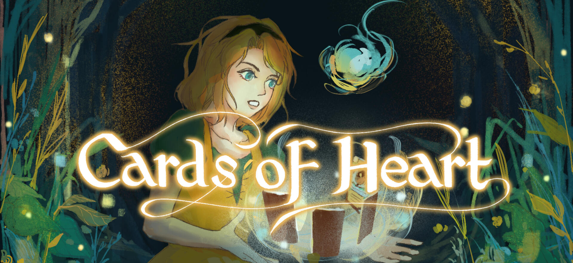
Cards of Heart
A cozy card-battler, top-down RPG, and Cognitive Behavioral Therapy teaching tool. Play as Amalia, a young woman in the fantasy town of Respite, and help her as she struggles with her mental health and defeating her inner shadows.
Systems Designer
Designed, tested, and balanced player cards with the systems design team.
Iterated on the card battling system, including progression and enemy design.
Integrated cards as rewards for quest system.
Facilitated and documented team playtests, and used playtest data to improve system and player experience.
Team Size: 39
Spring 2023 - 24
Published to Steam + itch.io and hosted on kozee.games!
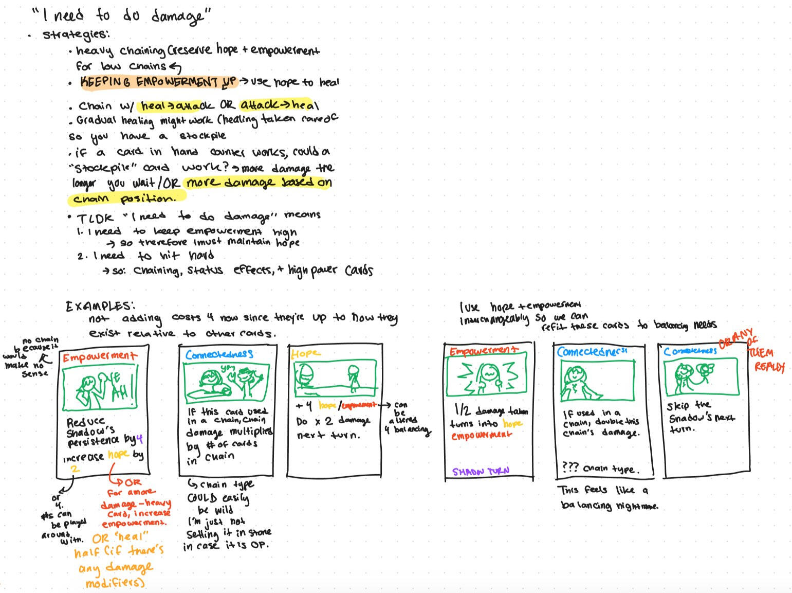
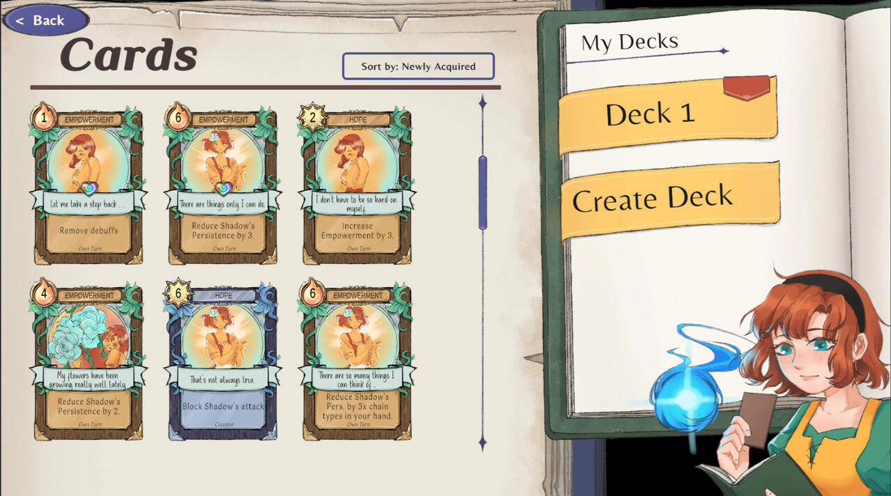
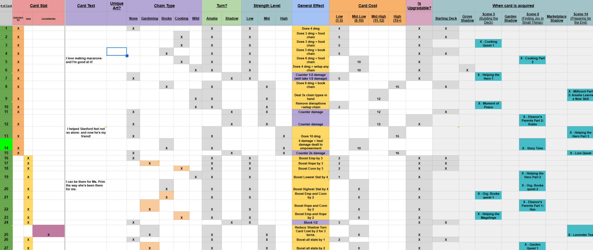
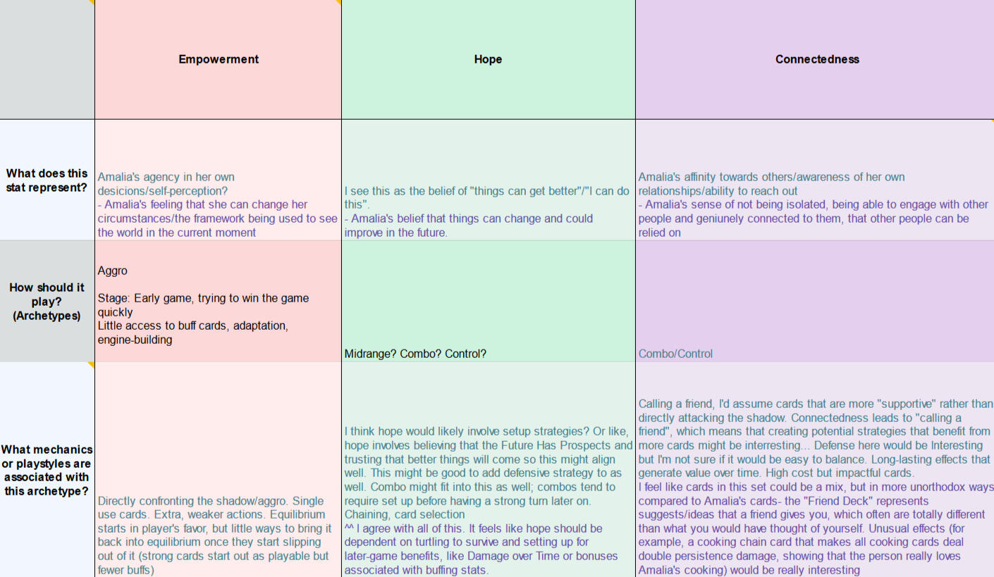
I collaborated with the design team to create the cards Amalia uses in battle. We designed around several player archetypes, reflecting how one might deal with their mental health, and deckbuilding strategies seen in other card games like Slay the Spire and Magic: The Gathering.Above is a sample of my thought process when designing cards to fit the Aggro/damage-dealing archetype. Empowerment is the stat that's focused on attacking, so I created cards that would supplement the existing pure attack cards.

Amalia's deckbuilding menu.

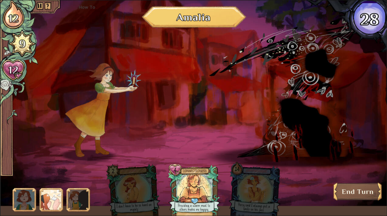
Amalia battles one of her shadows!

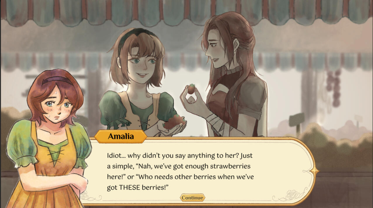
Amalia's memory of Eleanor, the friend she grieves throughout the game.
As a systems designer, I met with the systems team of 4 weekly to playtest and iterate on the game's core card battling system.
Cards were split into 3 stats, doubling as the player character Amalia's "health", and had chain types related to the activities Amalia must go through to receive those cards. Our process was to imagine archetypes players might embody, make cards based on them, and select and edit the final cards we'd add to the game's total spread.
We adjusted card costs, abilities, and chains to balance the overall card distribution and their effectiveness against Amalia's shadows. I contributed to card balancing through playtesting and adjusting values based on gameplay.Hope allows Amalia to "heal" and replenish her stats, Empowerment to attack the shadow, and Connectedness gave her buffs and the shadows debuffs, each playing to a different player archetype. Together, the systems team balanced the overall card spread to create strategies between cards for easy and fun deckbuilding that made sense from a mental health standpoint.
Connectedness cards are rare early game, as the stat represents Amalia's sense of belonging in her hometown. As the player completes quests and forms a connection with the residents of Respite, Amalia now has a more diverse range of tools to combat the shadow, and a the player has wider array of cards to strategize with when deckbuilding. Other cards were integrated into quests based on the quest's actions or the questgiver's personality.
This is an early brainstorm of Amalia's stats, and how they play into different archetypes. My commentary is in teal. I was particularly concerned with the game's mental health aspect, and all my goal as a systems designer was to create a balanced and fun fantasy system that maintained a basis in mental health reality.
12
Explore the children's MMO Doodlandia one last time. Walk through the final moments of your childhood digital home until the clock strikes 12.
Co-designer, UI Programmer and artist, Environmental Designer, Narrative Designer
Designed and implemented core game systems, iteratively improved with weekly playtesting.
Created and implemented UI based on classic MMO UI.
Designed, implemented, and setdressed the game’s layout and environment in Unity, and collaborated with 10+ artists to source character art.
Team Size: 2
November 2023 - January 2024
Published to itch.io!
12 started as a 2-week design exercise in evoking emotion through gameplay, and evolved into a 5+ week project.
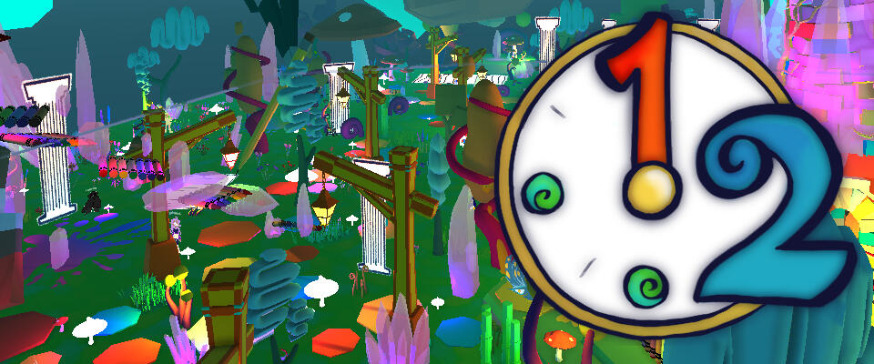
You, the player, log into Doodlandia, a virtual world where your drawings are brought to life by a magical clocktower. However, the servers shut down soon, and you must say your last goodbyes to the game before the clock strikes 12 and the magic disappears.
I handled UI design and programming, most of the game's art and environment. and narrative design. This was a heavily personal project for both of us, and large design and narrative choices were made jointly.We had both recently played PRINCESS INTERNET CAFE's Running Back to You, a game made for the Dying MMO Jam.
Taking heavy inspiration from it, the two games share a lot of narrative themes. Much of this was unintentional, but as we were trying to convey a very similar scenario through 12, it has many elements in common. However, our experiences had largely been in kids MMOs, such as Club Penguin and Fer.al, which had shut down when we were younger, which we also took a lot of inspiration from. As per the assignment, our goals were to evoke a specific emotion. We chose loss, specifically the loss of childhood, and reflecting on it as an adult.
Explore the dying breaths of the virtual world you grew up in.
Design + Direction
12 plays out like this:
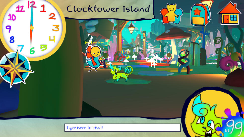
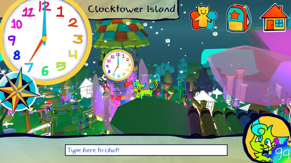
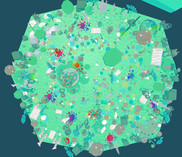
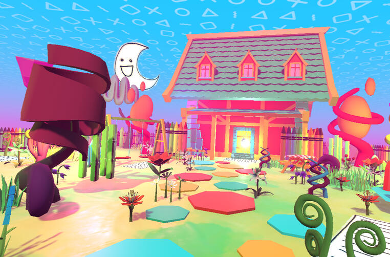
The player logs into and spawns at Clocktower Island, the hubworld and last remaining location of the Virtual World game, Doodlandia. Until the clock strikes 12 (6 in-game minutes), they explore the island, it's inhabitants, and through it, the role Doodlandia had in their lives.
Near the end of the game, one of the players' friends logs on, and the player can visit their home and meet them there to have one last conversation as the game shuts off.
How do we create a game system that emulates a pre-existing one without any of that system's elements?
Initially, our core loop was centered around a list of daily tasks that the player would never have the time to finish. Our intention with the tasks was that the game’s timer would end before the player would complete all of them and have a satisfying resolution.
However, after talking to playtesters and reflecting on our own experiences, we realized wandering around and talking to NPCs resonated with players and gave them the intended emotion of loss in a way tasks wouldn’t. This emotion was born from a loss of community and a world that was built by many people - something that wasn't inherent to any game itself.
UI
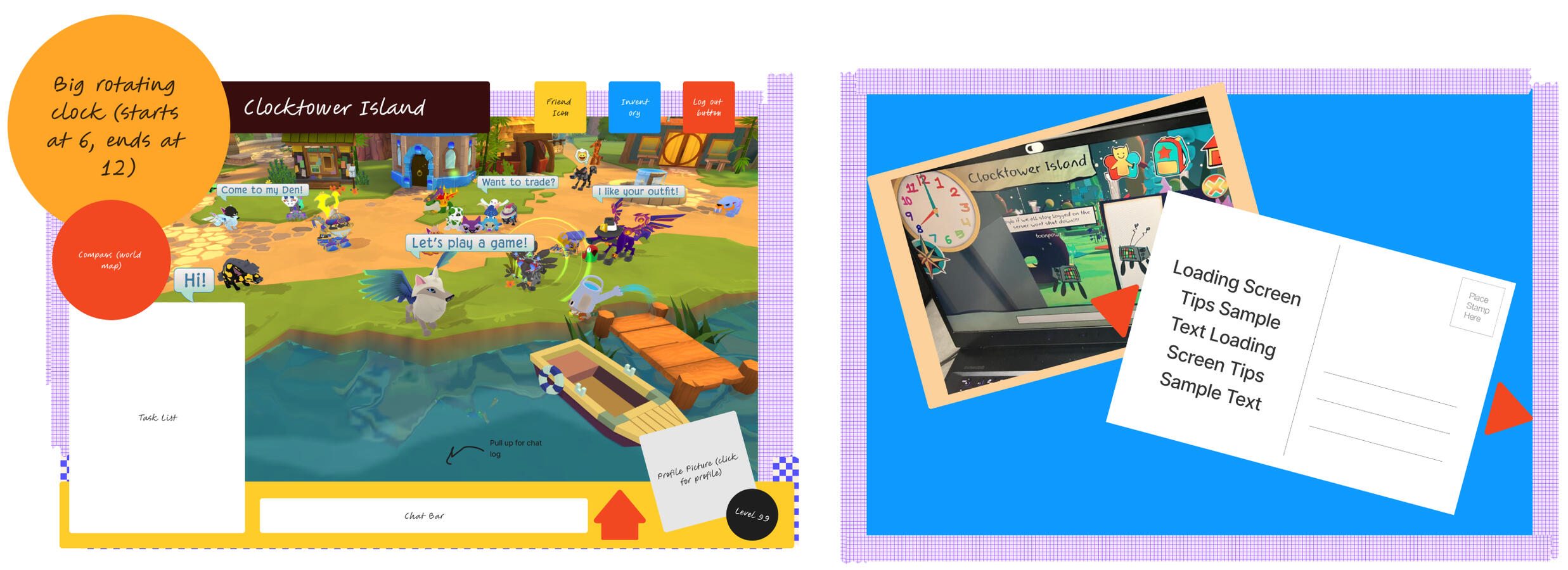
I took inspiration from the in-your-face UI often seen in kids' MMOs, specifically Animal Jam. I wanted the focus to be on the clock at all times, as a reminder to the player that they had limited time.
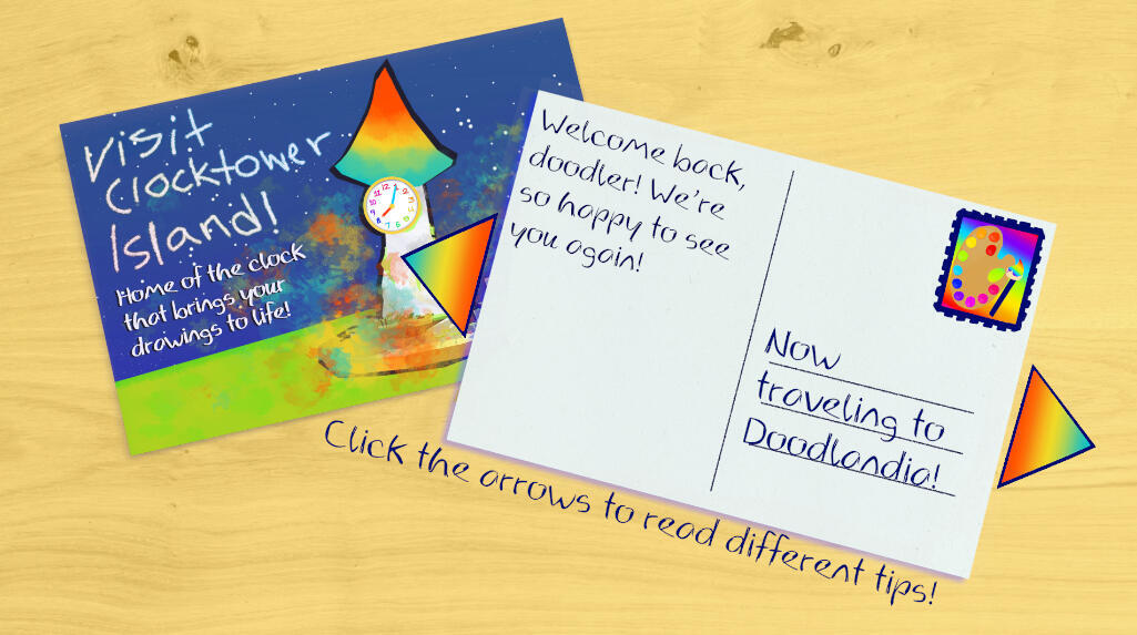
I also created the loading screen to emulate those found in MMOs, and hid a tutorial within it - the player can click the arrows on the side to get "hints" on how to play the game.
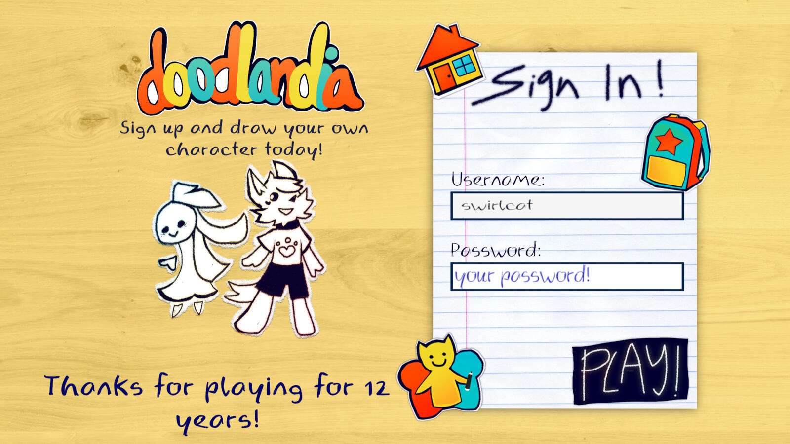
The login screen serves as an introduction to the game.
This UI was an exercise in accessible design while pushing aesthetics to an extreme.
Here's a sample of icons/illustrations I created!
ENVIRONMENT
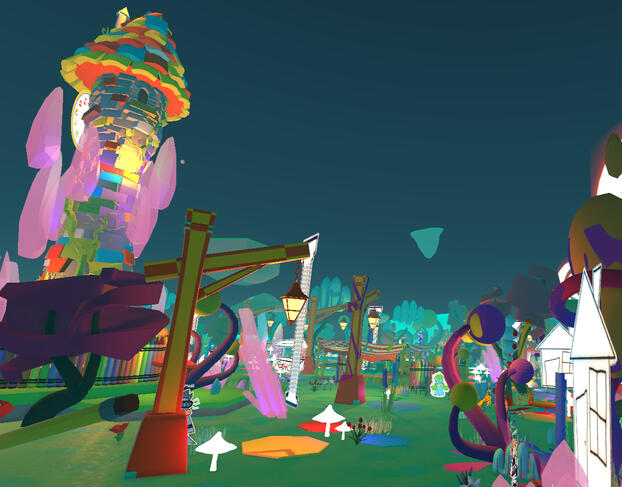
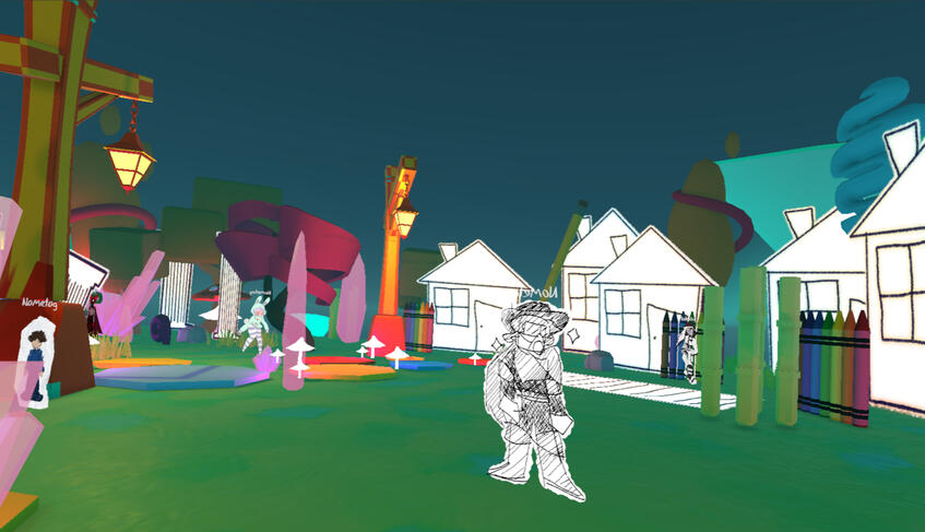
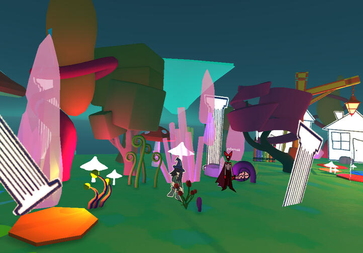
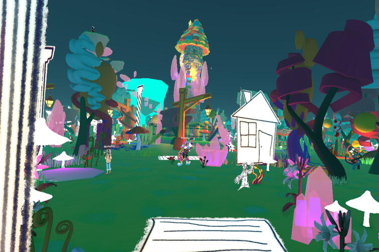
To save time making assets, we decided to create a 3D environment and combined assets from poly.pizza and Sketchfab. I also illustrated 2D "paper" assets to enhance the doodly feel of the game.
I put together the environment, taking inspiration mainly from Fer.al's fantastical forest landscapes.
I used a lot of craft supplies, crystals, and fantasy trees in the environment. I wanted the world to look familiar, but not entirely - something that would appear in a glorified memory. I also sized up and down many models, creating an environment where the player would feel both big and small - seeing the world from both the perspective of a child and an adult.
The island starts out in a paradoxical night when the sun is still out and everything is bright, and the player's home ends with bright patterned skies in a night scene.I wanted to make the player feel like they were falling asleep into a dream.
Since the game ran under a strict 6-minute timer, my goal was an evocative environment that was navigable before time ran out, which I achieved!
Some chose to spend more time in certain areas, and others went around the map to see everything, which created a unique experience for everyone who played 12.
NARRATIVE
The overall narrative of 12 was created between both my teammate and I. We were inspired by our own experiences and what we saw in online communities we were in around the time of MMO shutdowns.
Playtesters also resonated with the Clocktower during playtesting, so we leaned into the emotions it evoked.
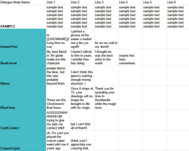
I created 60+ dialogue nodes for the characters we sourced from others, and tracked their implementation through spreadsheets.

A sample of the dialogue nodes in-game. There's a lot of easter eggs in the full game [:
Dialogue was altered to resemble internet speech of the time: a lot of mixed case letters, leetspeak, and abbreviations were used to write dialogue that felt like it was coming from someone else playing the game.
I also wrote bios for each of the 50+ NPC avatars the player meets in-game. This was based on the art provided by over 10 of our friends of their characters [:

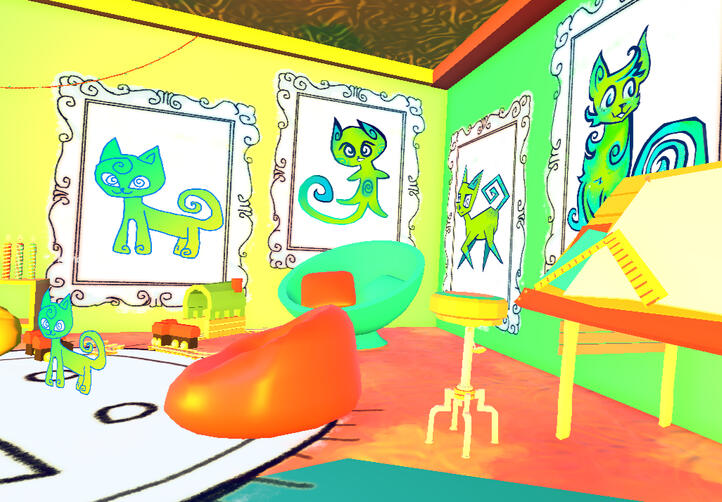
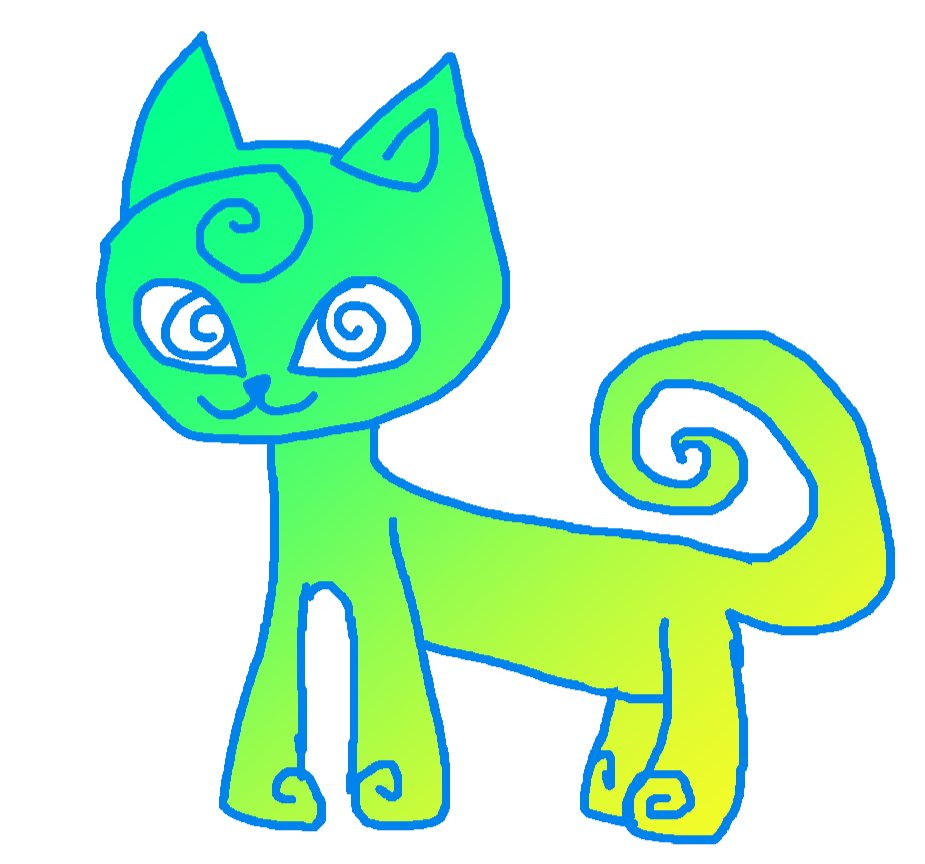
Swirlcat [:
Swirlcat, the friend you can meet near the end of the game, was initially represented by the player character's image. In accordance with our themes of childhood loss, they represent your childhood self.
This was pretty impromptu - we had used this asset as a placeholder for the player character, but grew increasingly attached to swirlcat.
POSTMORTEM REFLECTION
Both my teammate and I grew up playing virtual world games that later shut down. For me, it was mainly Disney Fairies Pixie Hollow, and later Fer.al. Looking back, these games didn’t have much actual gameplay, but the community and the memories we made together stuck in my mind. Those memories were specific to a time – as a kid, even though I knew they were just games, and maybe not even good ones, they felt like such powerful and open worlds. I wanted to capture this experience.As a 6-16 year-old, I met strangers who I was close with for hours, only to lose them when we both logged off. But I also made some of my closest friends after bonding over the loss of these worlds. I think there's a beauty in the ephemerality of these relationships - between the fragility of something only brought together by the digital.I played a lot of Animal Jam as inspiration for 12. It's one of the only kids' Virtual World games that is still online. Despite the game still existing, everything felt so different from when I was a kid. The game itself hadn’t changed much since 2015, but the people did. When playtesting in class, our SA mentioned the experience we were conveying through 12 wasn’t tied to a specific generation – people, and the relationships you have with them are huge parts of what spaces and communities are, and when those people are gone, so is the community.My other inspiration was the shutdown of Pixie Hollow – I was 9 when it happened and too sad to play the game after the announcement, but I watched a lot of videos people took of the game’s last moments. The servers were more crowded than I remember them ever being, and people talked about saving the game somehow, especially when the servers were still up past the scheduled shutdown time. But if the shutdown happened today, it probably wouldn’t have been little kids, and instead be adults or older teenagers grieving their childhood. I tried to imagine what it would’ve been like if it happened today for 12.Ultimately, 12 is a game about growing up and looking back at the magic of childhood and spaces created through play before they fade away. No matter how much you try to return to them, they’ll keep changing until there’s nothing left, and there is never enough time to save all your memories. You can't go home if home doesn't exist anymore.
DERAILED
Travel through a surreal subway system and help its denizens in this walking simulator inspired by Tati's Playtime.But is your destination really more important than the journey?
Co-designer and programmer, Level and Environmental Designer
Co-designed and programmed the basis for game systems involving swapping objects and character-object interaction.
Worked closely with and directed an artist for character and scene assets.
Curated assets to compose level layouts that change based on player-NPC interaction and completion of requests.
Team Size: 3
April 2023
Published to itch.io!

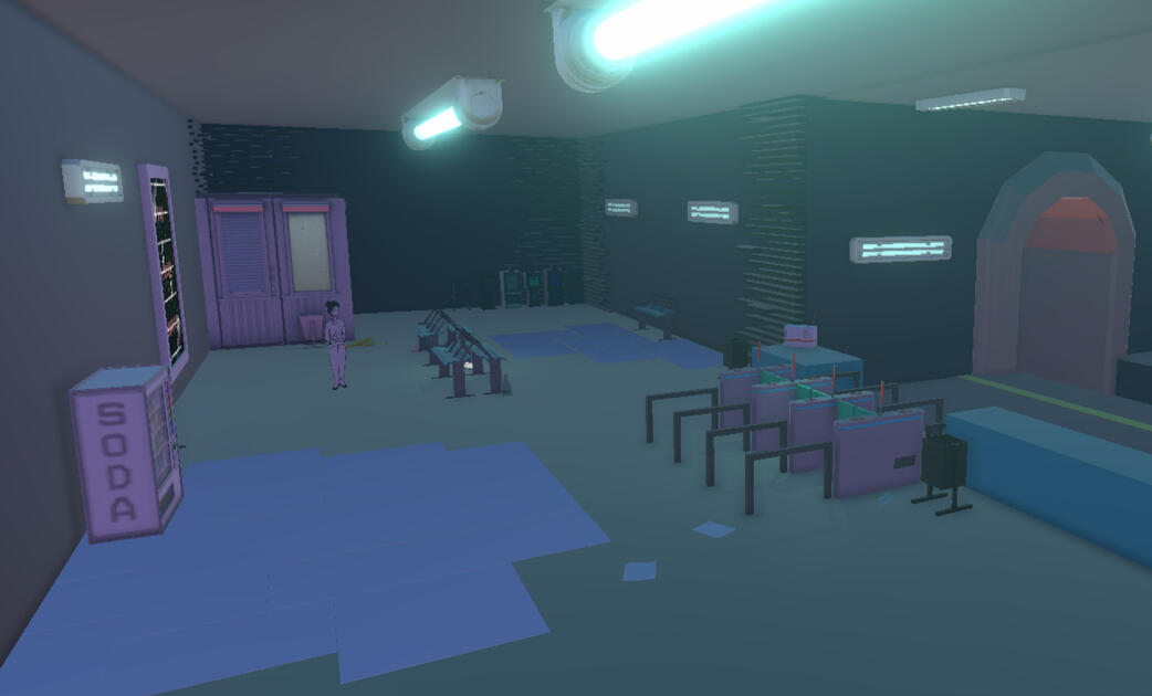
The first station - a lonely, monochrome, and utilitarian environment. As you help a worried businessman, the turnstiles turn into playmats welcoming you to the train.

The second station - an energetic wake-up call to your daily routine. After helping a lost child, all the trash turns into toys.

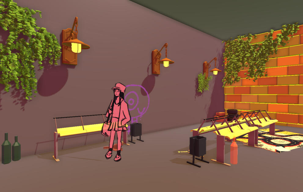
The third station - a vibrant hub now covered in toys and playmats. Help a homeless man, and all the hostile benches turn into fluffy beds.

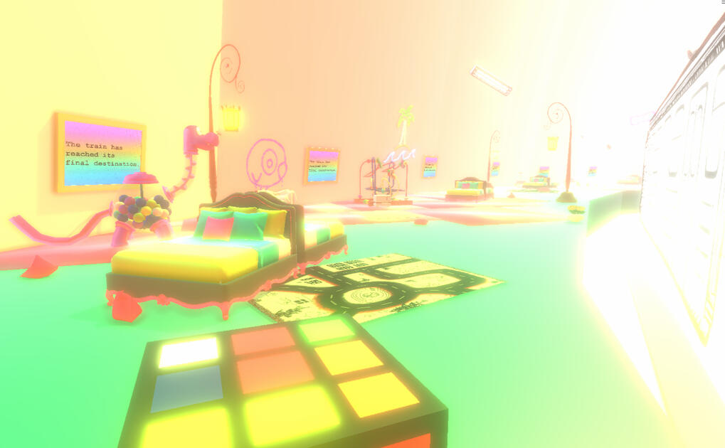
The final dreamlike station - the "curve has reassert itself over the straight line", and the train station has transformed into a dreamlike childhood bedroom.
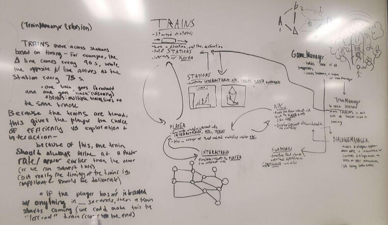
This game was created as our final walking simulator project in CTIN 289/290 during our first year of university. I collaborated with another designer/programmer to design and implement game systems, and an artist to create the in-game environments. This included a pickup and object swapping system. Throughout the 4-week development cycle, I updated the game's 18-page game design document which detailed every level's objective, characters, and theming.
Inspired by Tati's Playtime, I wanted the game to start with a fairly straightforward and monotonous feel, and gradually become more energetic and playful. As the player helps the subway system's denizens, it transforms into something evocative of a child's bedroom.
Playthrough by YouTuber Queen Faith Official.
BLINDSIGHTED
Escape your infinitely looping limbo of torment using your muzzle flash to see the demonic amalgamations pursuing you in this fast-paced first-person movement shooter.PHOTOSENSITIVITY + FLASH WARNING. PROCEED WITH CAUTION.
Gameplay + Level Designer, Artist
Wrote an overall level design philosophy based on fear, linearity, and movement.
Designed 3 of 5 level layouts.
Illustrated UI and cover assets.
Team Size: 7
Developed in 1 week during July 2022.
Published to itch.io. Placed 5th in gameplay and 10th overall in the Black and White game jam!
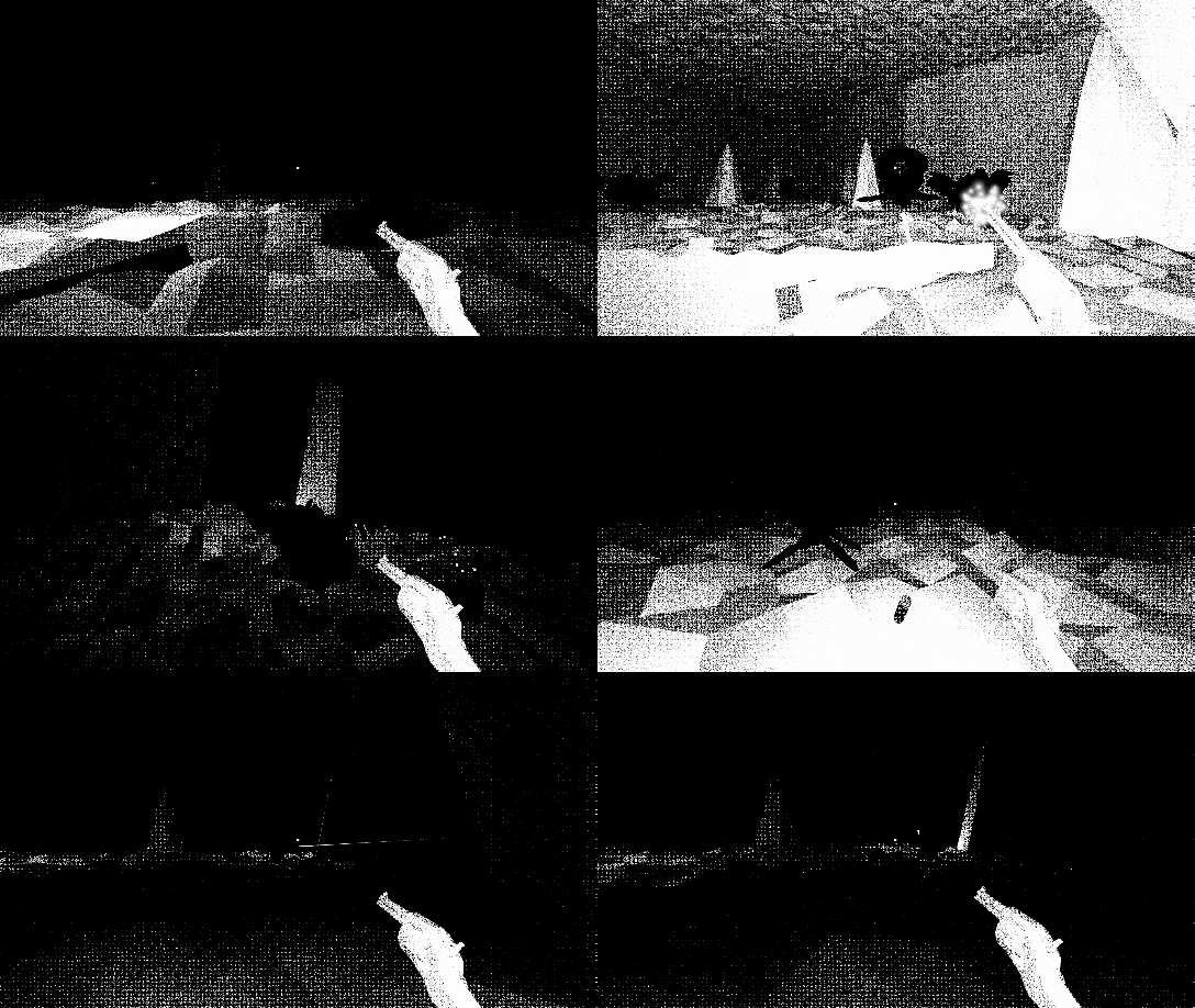
UI gun icons I illustrated.
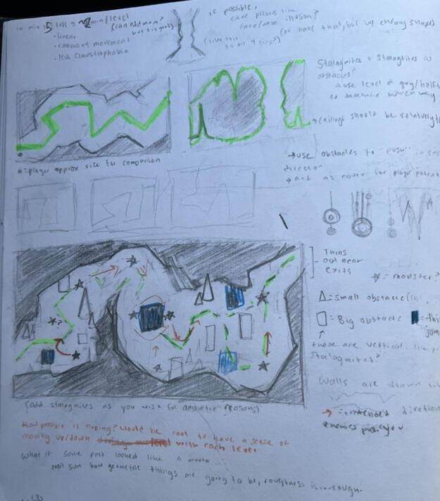
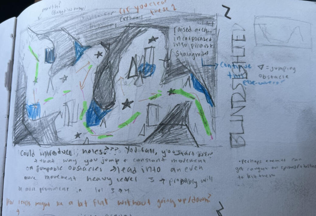
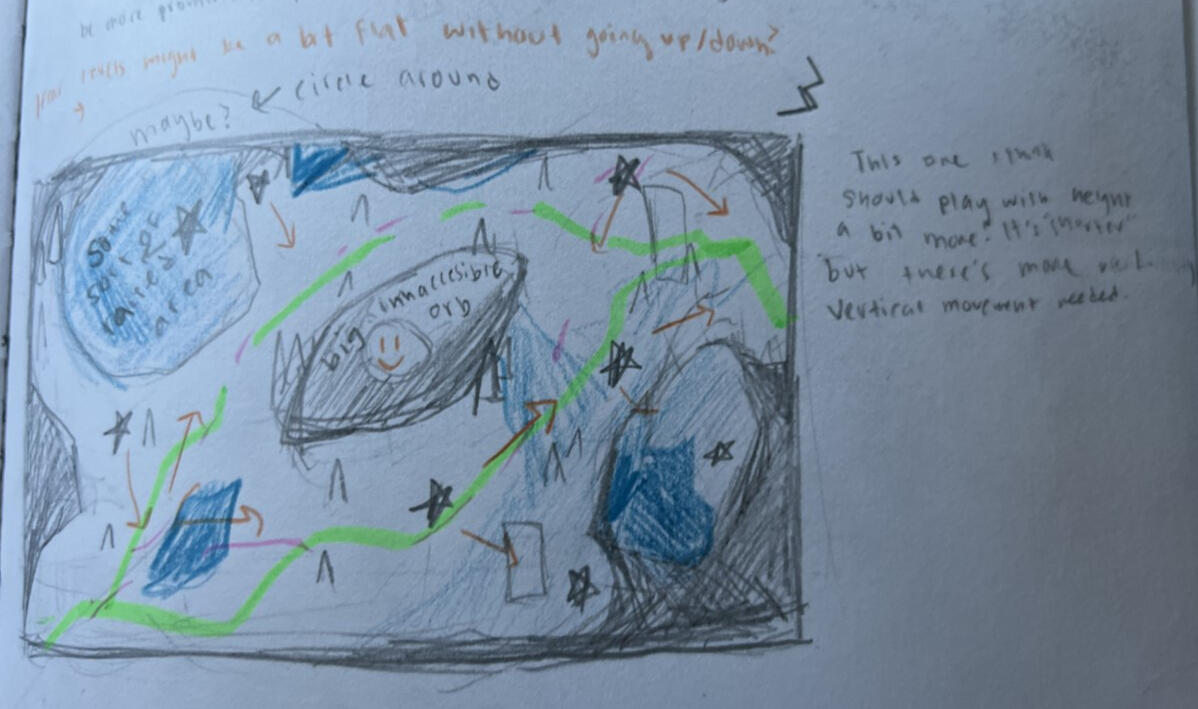
Our team's goal was to create something that both fit the first-person movement shooter genre but subverted it in the ways players interacted with their environment. This was achieved with the muzzle flash mechanic, the player's fast movement, and the infinite looping of levels. I wrote an 8-page level design philosophy based on inducing fear, diverting from expectations of linearity, and giving players satisfying movement options. This informed how we developed the game in the 7 days left of the jam.
Blindsighted placed 5th in gameplay, 6th in originality, and 10th overall in the 2022 Black and White Game Jam.
This jam was my first comprehensive dive into level design. The first 3 days were set for pre-production, in which I researched movement shooter gameplay to write design guidelines for the rest of the development process. This informed the levels I designed, which I sketched out in a notebook during a road trip, working with the rest of my team remotely. The overall process was fairly casual, but through it, I learned a lot about the level design process and the first-person shooter genre.

The first level layout + a few drafts and some thought process. This serves as a tutorial, introducing branching paths as the level progresses.

Second level, introducing more obstacles, but slightly more linearity. Since the levels loop, I wanted this one to be a break of sorts from the more intense branching of the other levels.

The third level, focused on using height to limit vision and movement. It's centered around a large obstacle in the center, and avoiding enemies that skate around it.
Minecraft + chemistry education
An individual formal research study on Minecraft Education Edition and game design for High School chemistry education.
Student researcher
Designed an experimental Minecraft- based chemistry map.
Conducted formal research playtests with 4 participants.
Analyzed data to evaluate effectiveness for High School chemistry education.
Wrote and published formal study.
Solo project for the AP Research course.
Developed September 2020-May 2021. Published July 2021.
Cited by 8 as of May 2024.Panja, A., & Berge, J. (2021). Minecraft Education Edition’s Ability to Create an Effective and Engaging Learning Experience. Journal of Student Research, 10(2). https://doi.org/10.47611/jsrhs.v10i2.1697
As part of the AP Research course, I conducted a study on Minecraft Education Edition's applications for high-school chemistry learning. Over the year, this involved creating a Minecraft map based on past game-based education research, recruiting playtesters for the map, observing how they learned, and documenting and analyzing the results. The study was published in the Journal of Student Research and has been cited 22 times as of March 2026.

NETEASE GAMES
EGGY PARTY! A trendy and goofy battle royale party game, complete with a whole Eggyverse of custom maps!
I was a Map Design Intern from August to December 2024.
Map Design Intern
Created custom levels, design documentation, and tutorials for Eggy Party's map workshop.
Collaborated with R&D and community management teams to create maps reflecting player desires.
Attended bi-weekly design meetings and daily message standups with a remote international team.
Recruited new players, held playtests, and supported the 100M+ plus community of Eggy Party, with a focus on expanding the North American playerbase.
August - December 2024
Team size: 10 (sub), 400 (overall)
As a Map Design Intern from August-December 2024, I was responsible for map creation, engine and community research, and game promotion following the game's US launch.
I focused on pushing the visual limits of the Eggy Party editor, creating mainly story and aesthetic-driven maps. Based on different in-game "seasons" and events, I created and published 6 maps over my 16-week internship. I worked with a variety of gameplay styles, but focused on integrating puzzles and mini-quests with maximalist but navigable environments.Through mentor guidance and feedback from the community, I helped increase Eggy Party's player engagement and US presence.
Additionally, I conducted playtests with target players for main game content, created a playtester feedback intake system, and provided both to the overall game team.I learned a lot through this experience - creating custom levels based on the needs and wants of a live service game audience was a great way to improve my communication and collaboration skills in a larger game development team, and designing for a social game provided a challenge I wouldn't have had otherwise!

Prism of You
Experiment with emotions in this emergent sandbox simulation by identifying, engaging, and expressing dynamic creatures known as Emoes - all while trying to maintain balance and uncover the secrets of this mysterious alien world.
Design Researcher / Systems Designer
Conducted academic psychology research and integrated it into preliminary design.
Participated in weekly design sessions + standups.
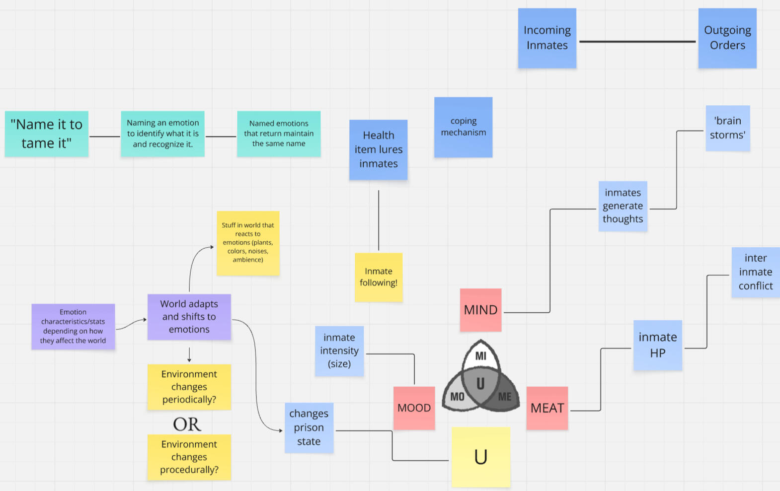
Created systems diagrams and paper prototypes to better understand the game's emergent interactions.
Wrote system design specs for game management systems.
Team size: 27
Summer-Winter 2024
Released on Steam!
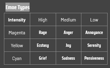
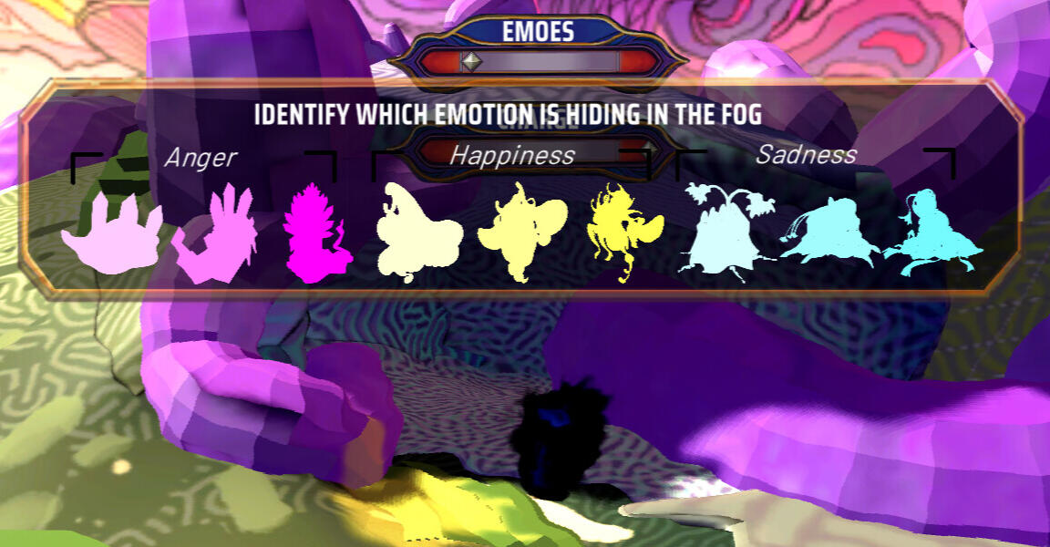
The 'Emoes' of Prism of you come in 3 flavors, with 3 intensities each. The player is tasked with identifying and managing their needs until their eventual release.
Prism of You's key goal is balance: no emotion in of itself is bad, but letting them out of control can be dangerous to the mind prism. Uncared for emoes will take over the prism, causing an imbalanced state of chaos. Give each emoe the attention and care it needs so that it can finally be released!
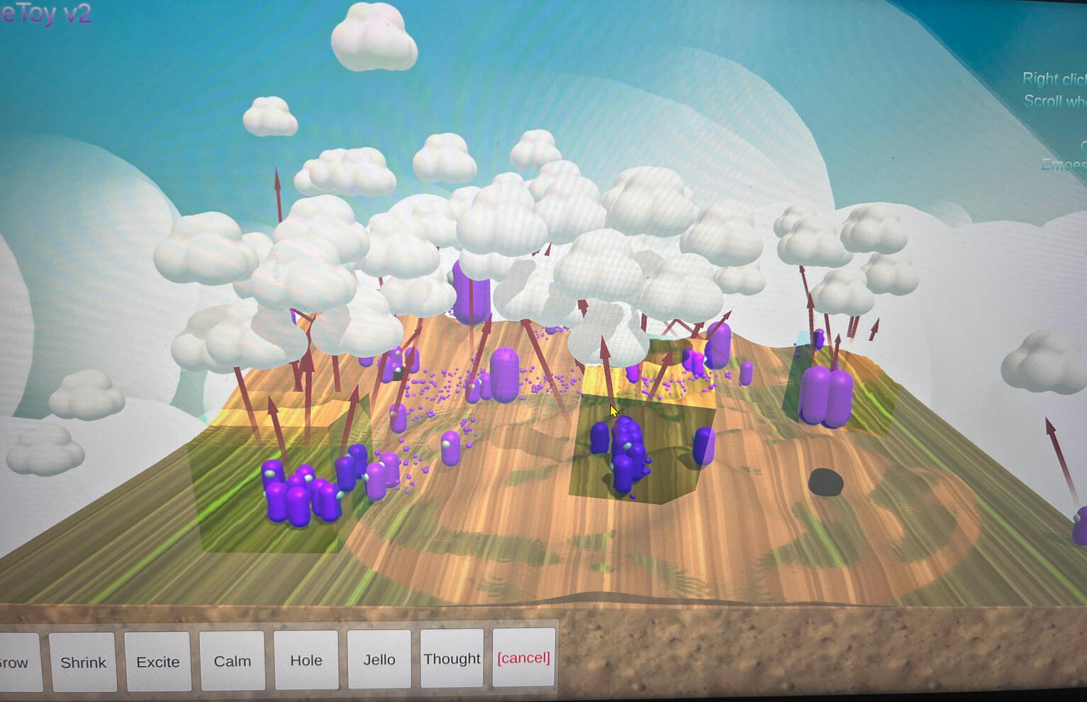
These systems were polished over months of development and testing: there are a few paper prototypes I created that weren't documented, and our development process involved a lot of systems testing and tweaking.
The game was released on Steam in Fall 2025.
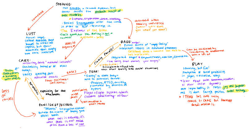
I initially joined the team as a design researcher over the summer, reading and analyzing Jaak Panksepp's work on emotions (along with other psychology and neuroscience research), and working with the Game Director to translate it into a quantitative system.
Panksepp's work already broke down emotion into a system, but translating that into a game was a unique challenge.I started by mapping the relationships between Panksepp's 7 basic emotional systems, much like I would a set of game systems. Our creative director had a set of terms for emotions she wanted to use in the final game, so this allowed me to 1. match those emotions to the base systems, and 2. develop secondary systems that would interact with those emotions.
Not all 7 systems are represented by Prism of You's 'emoes', but some are instead represented by the player and how they interact with the game.
Our director knew the emotions she wanted in-game (joy, sadness, and anger), so I mapped them onto the basic emotional systems. We knew we wouldn't have a 1:1 mapping of Panksepp's systems at this stage, but we brainstormed how other proposed systems could similarly connect.
SKIJORING!
Skijoring is a sport where a skier is strapped to an object that moves way too fast, for fun.
Skijoring, by Team Evil Evil, is a stylish co-op arcade skiing game. One player leads as a snowmobiler with player 2, a skier, tethered to them. Madness ensues.
Game + Level Designer
Alongside an initial team of 9, developed Skijoring from pitch to demo within the 7-week period of the Amazing Seasun Seed Jam.
Drafted, iterated on, built, and setdressed custom co-op racetrack levels in Unreal engine.
Pitched, designed, and created racing obstacles.
June 2025 - Present
Team size: 12
Featured at the M.I.X. Showcase at LA Comic Con 2025.
To be published by Monster Theater Games
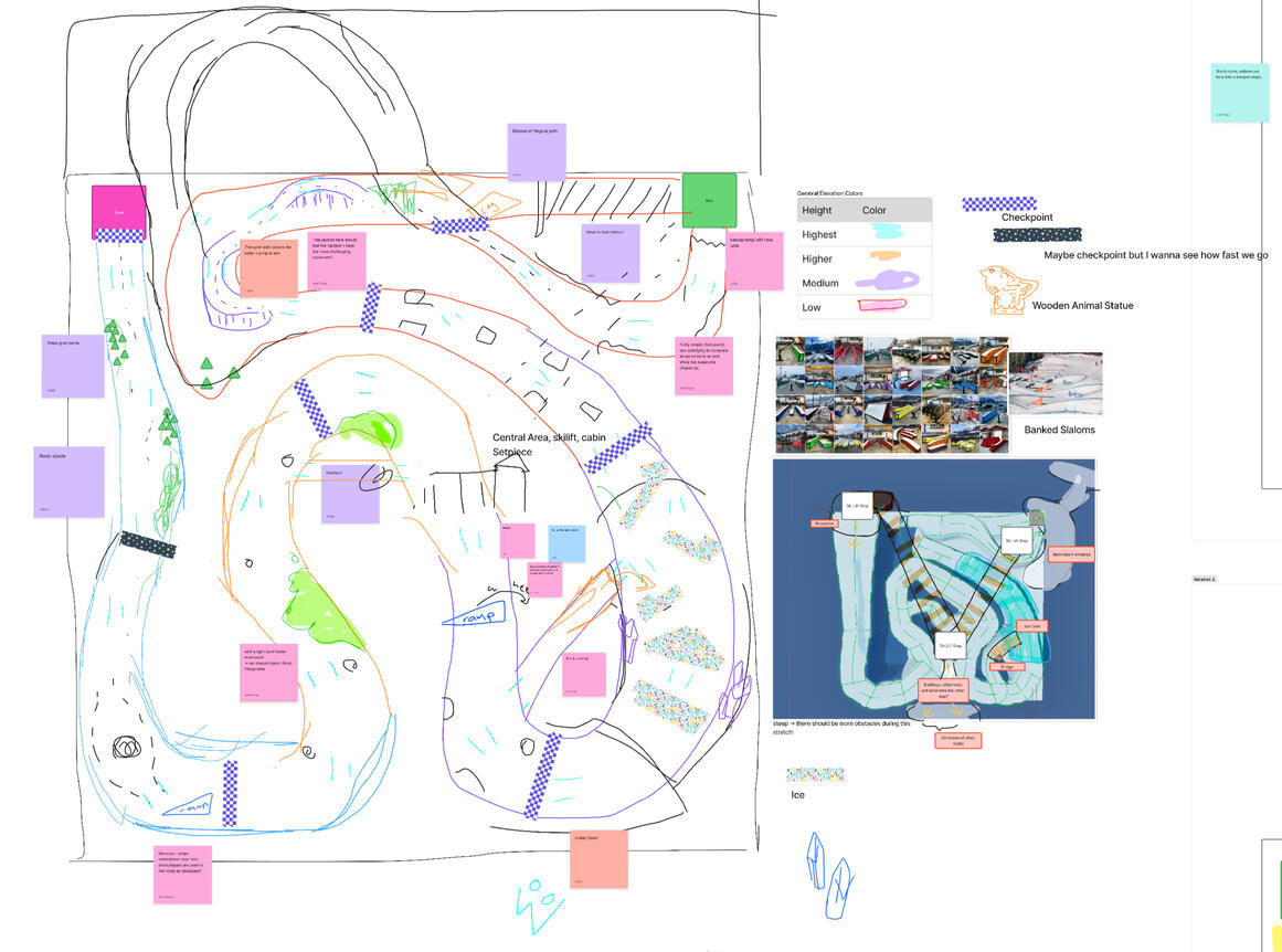
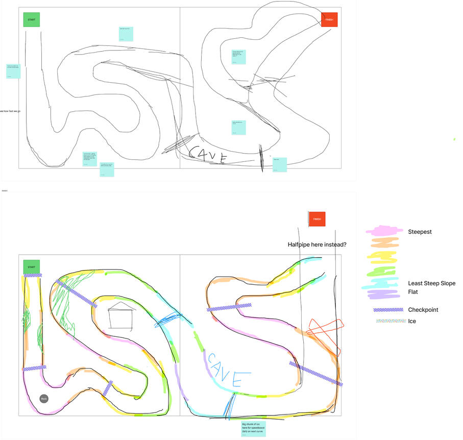
Skijoring started as an 8-week game jam project, and quickly snowballed into something bigger.We set out to make a new kind of racing game: it was challenging balancing the push and pull of skijoring with the dynamics of a racing game, but the two meshed better than we initially thought! One player controls the snowmobiler, and builds up speed to allow the second player, the skiier, to go through slalom gates, up ramps, and perform tricks to rack up points!I'm currently working as a game and level designer on this project, + helping showcase and promoting the game as we search for a publisher.Below is the level design process for Powderkeg Peak, the first track we created. We're planning on publishing 4 more levels with our Steam Demo.

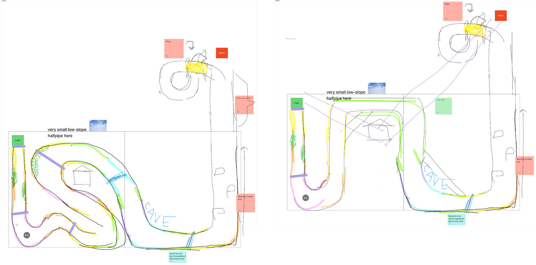
Powderkeg peak iteration 1. We labled this level with obstacles until we started to redesign the overall track.

Iterations 3-4. Beginning to add obstacles and shortcuts.

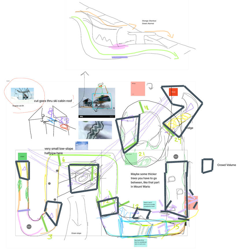
Iterations 3.5-4: editing the track to block out more distinct sections.

Final Powderkeg Peak draft. We used this to block out the track and add obstacles, but the final track layout was tweaked in-engine with playtesting.

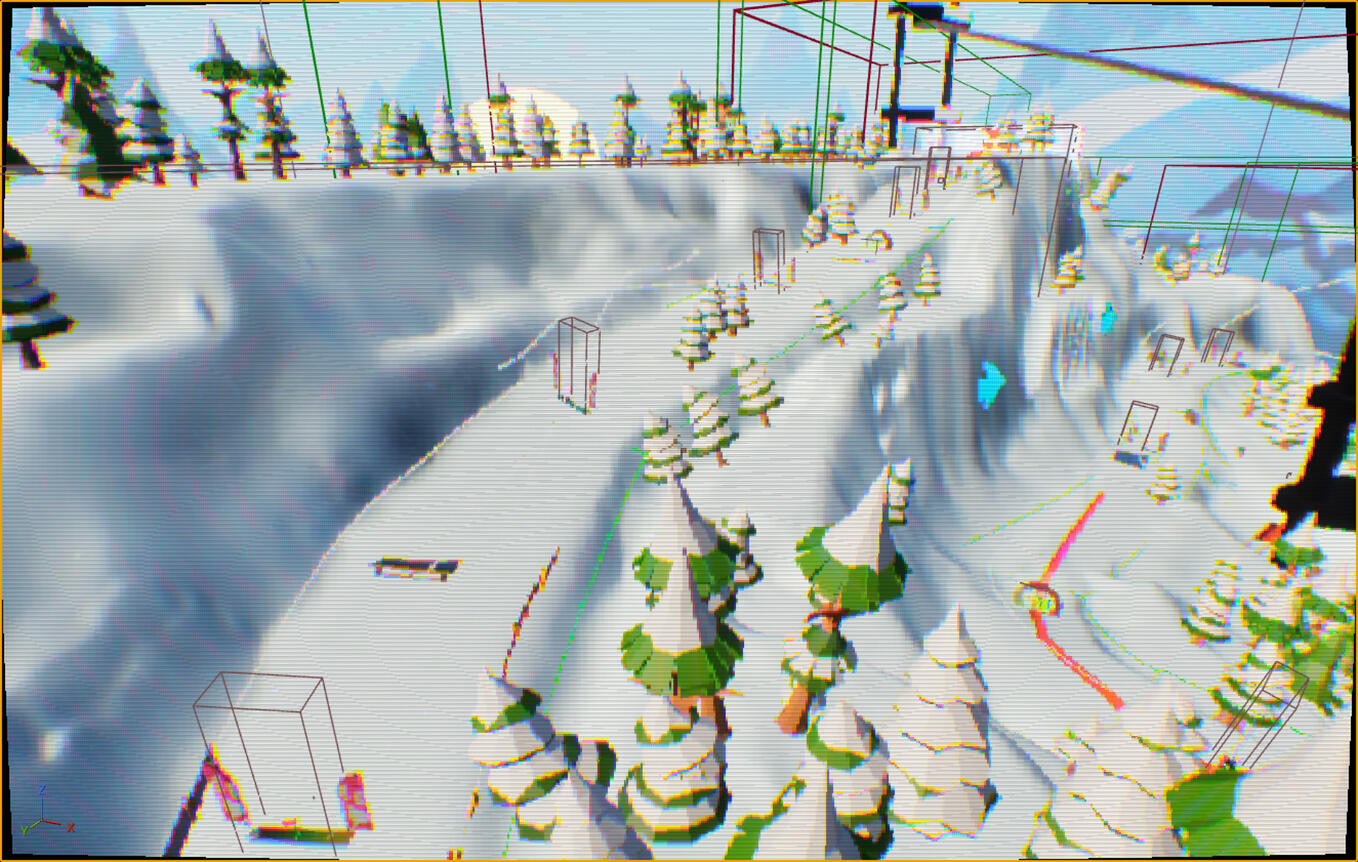
In-editor screenshot of the beginnging. Slalom gates give the player points,

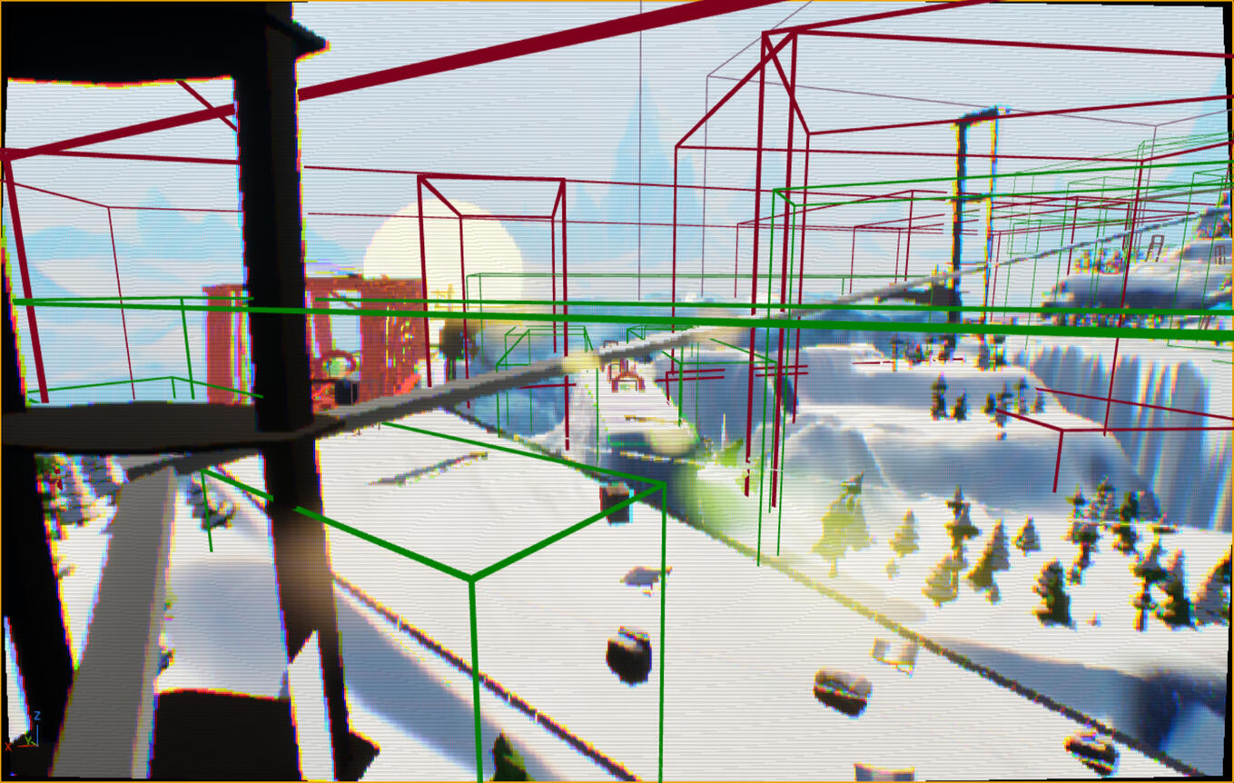
In-editor screenshot of one of the slopes.
The full level, as of August 3rd, is below! We're continuing to playtest + tweak it as needed.
Our demo releases during the June Steam Next Fest, with a full release later.Designing around Skijoring's unique tethered movement scheme was a great test of my skill and helped me learn a lot. I began by researching other racing + skiing games and referencing real-life ski courses, plus collaborating with our awesome design team. It was super satisfying seeing our initial sketches come to life in the actual level.Along with level design, I'm creating a dedicated tutorial + system for it that will be revealed with the game's full release.
![Digital ritual. Embody the blood of the prophet by writing on your [physical] skin. Co-developer, primary designer, art director.](assets/images/gallery62/b9abee5e.jpg?v=0e4f1676)
